I'll start and end with a contrast, the primary one not having been specified for this assignment. I have just returned from a trip to Dubrovnik for three days and then to Montenegro for 7 days. The duration isn't the contrast.
The contrast is pictorial and slight and whilst this is not entirely the best of comparison shots, there is a vital clue barely discernible on both shots. On the left is an Orthodox Church in Kotor, a beautiful old town on the Bay of Kotor in Montenegro. On the right, a detail from a Catholic church in the equally beautiful city of Dubrovnik, situated in Croatia. There isn't a great deal to contrast these two shots, they are both places of worship, they both have flags that have the same colours - albeit arranged differently; but crucially, with differing central Coats of Arms or insignia. That is the only material difference and the contrast that stems from it is a deadly one.

Reminiscent of that early Bob Dylan song "With God On Our Side", these two nations, along with most of the failed communist state of Yugoslavia were pitched in a wretched war and the Monument (left) that I found outside a very small fishing village in Montenegro bears testament to the futility and waste of war. It is the sheer volume of life extinguished from such a tiny community that I found abhorrent.
The photographic poignancy of this for me is that the upper right plaque refers to the Crimean War dead from this speck of humanity in the Balkans and it is, of course, from where Roger Fenton "the first war photographer" took those early images. The inscription (vertically in Cyrillic) to the left on the monument translates to "Died For Freedom". Plus ca change.
_____________________________________________________________________________
All these photographs came from the few days I had in Dubrovnik and Montenegro; that's not what the holiday was for, however I used the opportunity to resource the images and discipline myself to try and fulfil the requirement for the assignment whilst I was there. I had hoped to have contrasting formats - portrait/landscape for each pair and monochrome/colour also - and nearly succeeded.
Still Moving


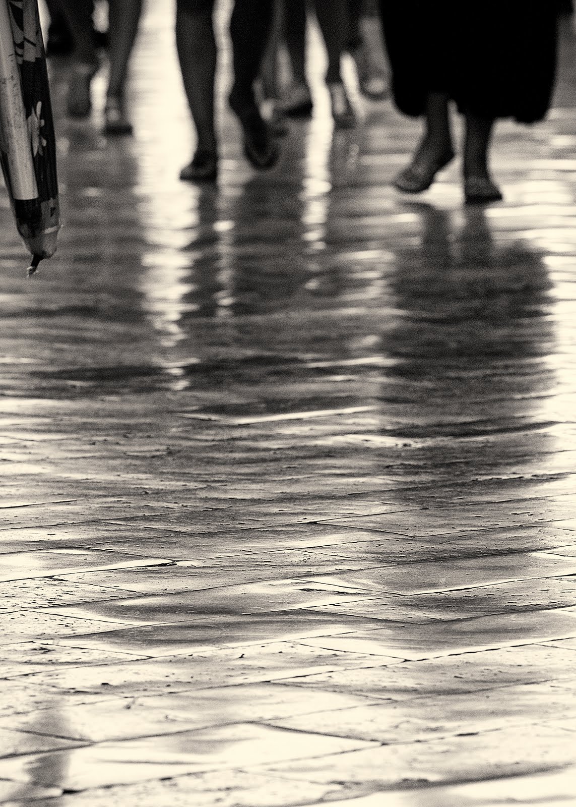
The boat isn't going anywhere. It is still. It is at rest, recumbent against a step, away from the sea and holed beneath the waterline, it is difficult to see this vessel ever pitching against the waves again. The shot is tightly cropped in the camera and this is a full frame delivery. I felt the relatively low contrast, monochrome and sepia toning speaks of a by-gone time and sympathetic to the theme of the shot. Whereas the street scene in the centre of Dubrovnik has much more energy about it. I was initially attracted to the shiny and very smooth surface of the stone road and whilst I managed to grab some shots without people (difficult in Dubrovnik in August), it was the images with people present that worked better for me. The photograph is toned monochrome again - the full colour shot is almost monochrome - the stones having a strong blue tone running through them, but the material on the left was a a strong blue and yellow and I could either crop it out or tone it out - I took the latter choice. The shadows compliment the feet and provide the corporeal presence and this, together with the feet clearly in motion, provide the movement.
______________________________________________________________________________
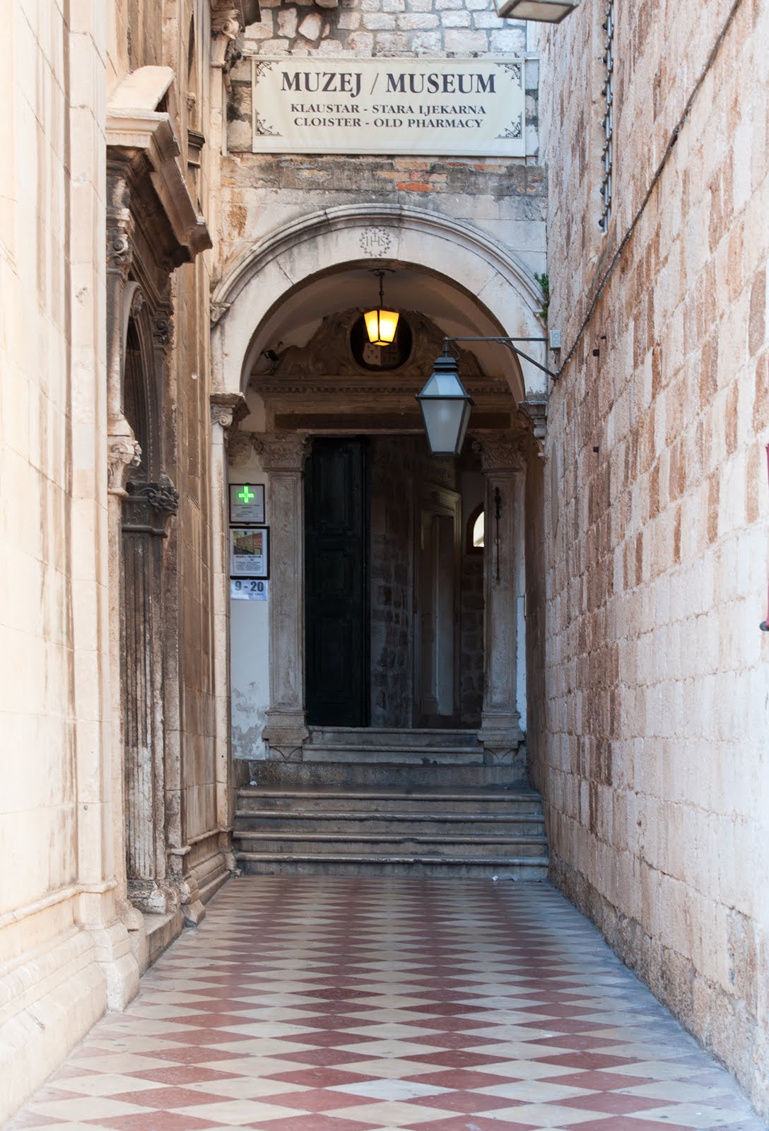
High Low
The "High" shot was taken in the very narrow streets in Dubrovnik and this image was taken looking directly up toward the sky, capturing the laundry which link the buildings - over and above the tourist another allusion to "High". The monochrome decision was taken firstly due to the singular colour of the laundry - mostly white, the lack of tone in the stonework and I think it helps the direction of travel for the viewer, that is in one direction only to the blank area i.e up and "higher".
The "Low" image contrasts in several areas, it is a shot of a puddle on the floor i.e. the opposite of "high" and of course it is in colour and not monochrome - albeit with a restricted colour palette. Another contrast though is that the focus of the "high" shot is a blank area whereas the focal point of the low shot is the part of the image with the greatest detail - in fact the top of a very high hill outside the town boundaries. By pure coincidence the arrangement here has the two aforementioned sections orthogonal to each other thereby compounding the contrast.
______________________________________________________________________________
Broad Narrow
Despite the initial appearance the "Broad" photograph is a full colour version - it was a hazy day and I was at a relatively high altitude which limited the colour palette. The detail that is present across the foreground is suggestive of the scale of the image, the slow reveal of the ships to the left of the image will further emphasise the width of the channel in the mid distance and there is barely discernible detail on the coastal line on the right hand side further developing the impression of scale. There is tonal variation in the foreground, but it doesn't affect the scene in any way. The "Narrow" photograph on the right is an impression of apparent lack of width of the river which is derived from the viewpoint, quite high up overlooking the feed to Lake Skadar in Montenegro. The breadth of the plain as it reaches out to the lake, turning to a wetland before reaches the water emphasises the contrast to the tributary feeding the lake from the western side. In fact the channel is navigable from quite a way upstream - there are boats on the channel at the edge of the tree-line. Both of these shots were dependent on a tripod with the "Narrow" shot using a 70mm lens and the "Broad" one using a 120mm lens (the same telephoto zoom lens).
_________________________________________________________________________________
Liquid
The sea. The evening before I took this photograph I had been watching the sea and wondering at the constant nature of the movement on the surface of the ocean. The light had been low and creating a stronger contrast than on this shot and it seemed to me to be as close to watching infinity as there could be. I am not sure if the Dalmatian coast in this area is particularly prone to a constant agitation, maybe it's to do with the islands - but the sea wasn't still, it moved; it was fluid. A full colour shot with almost no work on the image.
Solid

The door of the church in central Dubrovnik (therefore Catholic) appeared new; I suspect it may have been replacement from when the city was under constant bombardment (another example exists later in this submission) from, mainly Montenegrins who besieged the city when they were allied with the Serb's. Dubrovnik is, in European terms, a new city, it was established in the seventh century however this door looks positively brand spanking new. I desaturated the image and then toned it this nut brown colour, so it is a monochrome image, in contrast to the sea - which is of course a trite contrast. The apparent solidity of the image contrasting with the liquidity of the water belies the opposite contrast of age - the sea being somewhat older than either the Orthodox or this Catholic church.
_________________________________________________________________________________
Many Few
The Old town of Kotor sits on the Bay of Kotor; behind it, to the south are hills and the Bay is in front and is it's commercial heritage. This shot was taken from the city walls which have historically protected it from invasion. It is difficult to discern any pattern or structure to the town - especially from this angle. The roofs seem dispersed in a completely random fashion. I cropped, in camera, to keep the image depicting the rooftops and to not include the bay and the hills in the distance. By contrast the "Few" image was taken overlooking the sea. I am not aware of what the plant is and it did strike me that it was a little precarious. The composition used depth of focus to isolate it from the background of some other vegetation and the sea; there was no horizon in the shot as I was shooting in a downward direction
__________________________________________________________________________________
Curves
This detail was part of the ceiling design in Dubrovnik. Clearly the symmetrical nature of the composition is important to the image and whilst this is a duotone there wasn't a great amount of tonal variation in the cloisters where this photograph was taken. The important aspect from the image construction was to allow the eye to resolve in the central circular rose which was accomplished by having the upper arch out of focus with depth of field, and some vignetting post production to help keep the eye contained.
Diagonal
This lady sat on these steps intent on her mobile telephone, maybe reviewing a text message or compiling one. The line of her eye looks through the telephone through to the bottom right hand corner of the image and the extension in the opposite direction is very nearly top left, thereby cutting the image in half. The steps echo this line very well albeit they run out 2/3rds within of the image; had they done so more or less I think it would unbalanced the shot. I don't think there is anything to say about the black plastic sack, the soft tones of the stone work are pleasing and the pillar to the right neatly frames the end of the photograph. I had very little to do to the image, it seemed quite ready.
__________________________________________________________________________________
I hope to make clear why I have used the same subject, but with contrasting reasons!
Large Small


This very large bridge bestrides a valley that leads to the sea (I have taken the image from a boat). It is a magnificent edifice with some beautiful geometric constructs that I found very appealing. There is a coach that is leaving the bridge on the right of the photograph which gives a real sense of scale. I was lucky with the weather, the available light allowed a fast shutter action on low image speed allowing the colours to saturate naturally and the absence of cloud didn't disrupt the sight lines of the white wires. The contrasting shot on the other hand is included because of the scale of the individual at the bottom left. That short thin dark speck - just inside the first wire bottom left - is a person looking over the edge - I suppose there is a path alongside the road, there is certainly a fence! There is detail on the sign immediately to the right of the main pillars. Both images are better composed with the main pillar set to the right, the "Large" image as it naturally balances with the construction of the bridge whereas the "Small" image as the angle of the wires are dissimilar. The very clean lines, complimented by the clean sky also help these photographs deliver the feeling of efficiency and purpose.
_________________________________________________________________________________
Pointed Blunt


The "Pointed" image is a detail from a sculpture in central Dubrovnik and don't think there is awful lot to say about the image. The subject is clearly writing and the detail at the point of inflection where the right hand forefinger is in contact with both writing tool and the parchment is very carefully worked, suggesting that the subject was famed for his writing or at least the words that he committed to print. The rest of the statue is not as "rubbed" as this part, suggesting also that the subject was probably a spiritual leader and people have continually touched both the hand and what was written on. The arms, the hands, the writing implement all lead to the same point and at the time of photographing the image the light was shining on this part of the statue - which was probably a consideration when the statue was situated. The contrasting image is a post that connects glass panels surrounding a swimming pool. Chromium plated posts with a blunt but very shiny top; a very simple utilitarian object that fitted the blunt but not dull - in fact the opposite of dull.
_________________________________________________________________________________
Contrast in the image
A curious phenomena that I witnessed in the the short break in Dubrovnik and Montenegro was not the amount of Russians who visited both Croatia and Montenegro, after all the Dalmatian coastline had long been a haunt of apparatchiks of the former Soviet block. It wasn't that there was a great number of apparently very affluent young people who were travelling through - maybe on one of the many super cruisers, some with their own helipads. No it was the way the young women would pose at the drop a hat (wide brimmed or not). These young ladies, and some not so young, would adopt very coy looking poses for the camera; these cameras could be held by boyfriend, husbands or female travelling companions who would, after a series of shots, return the compliment and do same for the other.
I took advantage of the pose this young lady adopted for her camera wielding accomplice. The model was standing in front of a large fountain just inside the old city wall in Dubrovnik, there are some eight or so fountain heads around the fountain and the locals drink straight from the pipes, fill their water bottles from them and generally make use of the very clean and free supply.
Dubrovnik was held under siege by the Serbian forces for about 5 months until the Croatian forces mounted a counter attack. A large part of the city buildings were damaged in part by the armaments, most of which had been manufactured by the Soviet military machine. This young lady has a fine complexion in contrast to the fountain which has, besides the wear are tear of centuries of use, several pock marks from bullets. Incidentally all across the region there are buildings, road signs and other targets riddled with bullet holes. The lady is young and the fountain isn't, she is clean and the fountain isn't, but it is likely the fountain will be when the lady isn't anymore.
_________________________________________________________________________________
I expected to take shots for personal projects on this trip - and have done so - but increasingly I felt that the project has started to inform my personal work already, something I didn't expect to happen so soon. I have always had a strong desire to connect my photography with either a sense of place or purpose, simply leaving a scene with a pleasant shot, whilst it may be a "result" would leave me feeling slightly unfulfilled and this more important when the photograph contains people. There are very few people in this assignment.
I have found this Assignment interesting from a few perspectives. As is clear I have intertwined the history of the two places into the assignment; I think the contrasting shots work without the historical perspective but adding it allows more reflection to occur. I have tried not to express any bias, I wonder if you feel there has been?
 Focal length 12mm, f22
 Focal length 24mm, f22
 Focal length 70mm, f22
 Focal length 140mm, f22
 Focal length 200mm, f22
 Focal length 400mm, f22