Wednesday, September 28, 2011

Geometry and the elements of design

It's been a while since I put finger to keyboard and this entry will attempt to put down some of the groundwork for some of the exercises in EoD.

I knew I would need some resource when I went to Dubrovnik and Montenegro and some of the photographs are from that time - about 4 or 5 weeks ago and others have been taken to try and give a broader response to the requirements of the exercise.

I feel confident that I understand the constructional requirements in these exercise but I am acutely aware that I need to do two things:

Firstly to provide more evidence from imagery that has been taken to fulfil these exercises and secondly to try and interweave some narrative into them.


Lines: Horizontal, vertical and mixed.

This is an image I took many years ago and vlearly it is about the twin trees that are alomost at the horizon. The newly worked field has a clear direction of travel to those trees and whilst this is a full frame from a 6X6 negative a better viewpoint (for this exercise) would have been to reduce the sky content and effectively raise the horizon.
The next image was taken a week or so ago and I had the above image in my mind at the time. I raised the horizon and used the vertical lines lines to draw the view to the horizontal. The twin tress are over the horizon but balance the image.


The images here uses both horizontal and vertical lines to draw the view to the horizon in the upper shot there are telegraph lines echoing the horizon, whereas the lower image has bolder verticals and horizontals due to the stronger light on the day this was taken


An alternative image with a combination of horizontals and verticals are these holiday chalets - complimented with orbs of greenery. A very regular structure
Diagonals


The picture above - taken from a dungeon in India has a very strong diagonal, in fact it could be said that there is nothing else in the image, whereas the the image opposite it is more complex with a number of diagonals all competing - I had decided that this was a monochrome image, albeit toned, to help with the visual decoding.


The image of the piece of deadwood was constructed along the vertical, but it could be argued that a more complex construction is available via the "turn" in the wood towards the top right corner. The image opposite has a very strong diagonal light ray from top right to bottom left


This pair of peacocks are perched on the diagonal, both interestingly looking out of the frame.


Newer shots


The portrait is composed on the diagonal which can be an effective technique for portraits. The landscape opposite has a rolling diagonal which might be emphasised more dramatically with a narrower crop to remove some of the redundancy in the lower third.


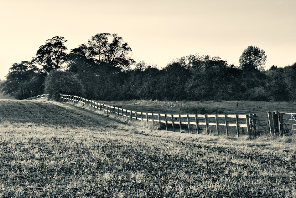
A much weaker diagonal using the fence


This hog-weed head has a variety of diagonals running through it - bottom right to the left third and from that point to various points on the frame edge.


These early morning churchyard shots rely on light rays to provide the strong diagonals; soon after the mist would lifted and whilst it was a nice sunny day there would have been no real opportunity to describe the scene in any meaningful way for the exercise.


Triangles

The tomb has a very strong triangular structure, but whilst the compositional idea is very obvious the positioning of the tomb within the frame could have been better placed to bring the apex of the window both centrally in the frame and above the casket itself.


Up to date shots


The bell tower on the left has a clear triangular structure and the boat rope opposite has an implied triangle - or it could be said that the horizon resolves and brings two distinct triangles to the image.


The hogweed stem has some clear implied triangles even if the edges are slightly curved, whereas the metal framework has a multiple of triangular structures to               dwell upon, both implied and actual.


The grass stems opposite create a couple of implied triangles. The very short depth of field is used to bring forward the construct in what would otherwise have been a very confused image.
The ship's mast below has multiple triangles, implied and actual as well as implied rectangles that utilise the edge of the frame to deliver the


Circles:

 This is another piece of deadwood that I captured some years ago and whilst the image is a little flat it has a clear circular viewpoint.


The hogweed seed head is set in a semi-cicular form


Compositional lines

 This shot, again of the deadwood has a very distinct direction of travel for the viewer to the boat, even the cloud extends a radial point to the boat.


Friday, September 16, 2011

Toshio Shibata

I'm not entirely sure why, but my tutor suggested that I look at the work of Toshio Shibata a contemporary Japanese photographer - and I'm very glad he did.

I have a high regard for what little I know of Japanese art and what I do know seems to have some parallels and that is maybe why I am drawn to Shibata's work. Until now I had been aware of Japanese literature in the form of (amongst others) Ishiguro and Murakami, both of whom I have read (I think) all they have had published. The link between them is the West. Ishiguro moved as a child to the UK and is now a UK citizen, Murakami travelled extensively and lived in the USA whilst Shibata studied in Belgium. I wonder if I find it easier to connect to these artists because of their sensitisation to Western culture? It is true that Ishiguro is the least "Japanese" of the three, the others having resettled back in Japan, but both Murakami and Shibata created work whilst in the West - something to think about later.

Shibata studied fine art at the Royal Academy Ghent and started to use the camera as part of his creative process. The camera, and the mages he created with it, started to become his metier and is now his primary form of image creation. Later Shibata was impressed by the work of American photographers such as Adams at an exhibition in Paris and later, when he went to America he found others, such as Weston and Meyerowitz - these were to become a major influence on his later work.

When he returned to Japan he started to photograph mainly at night, at toll booths and garages - as below.

These shots are typical of his early period and are dissimilar with his oeuvre that he has become synonymous with. It is interesting that he was unafraid of using negative space in these shots and there is very little in his later work.

Note the lack of Sky!


However, the work that has brought him attention is his "Infrastructure" project; it is monumental in scale, in fact the subjects are so large that they are in danger of losing their proportions in the frame and the viewer is constantly looking to reinforce the understanding of the photograph by looking for a scale reference. Shibata notes in an interview (referenced below) that the Japanese are proud of their  infrastructure projects, they positively rejoice having one in their own back yard - no nimbyism here! - and it is worthwhile noting also that Shibata is taking (see note on not being able to make a photograph) his images from completely accessible places - I wonder if they would be cordoned off in the West?

 These hugely impressive photographs are exactly that to me - huge in scale but dispassionate, they adhere to a some of the very basics in composition: diagonals for dynamism, thirds and  symmetry for balance. But, they do not show the sky at all. I have looked to try and find some evidence of the sky and I found one picture that had a twilight sky. The night shots do not have any detail in the black space above the subjects - just a curious point.


Toshio Shibata quoted as below;

I employ a particular kind of sensitivity for approaching landscapes and sceneries like still lives. It's in way as if I was placing them right in the palm of may hand for examination. That's why I never included the sky. Showing the sky would mean going back to depicting landscapes.

There are a few other things that I always keep in mind when photographing. Grasping the subject matter instantaneously, for example, and leaving the scene before beginning to think about the subject's meaning.

I also avoid gathering too much information about the location of a shoot. Not letting knowledge affect the work is essential. And ultimately, I'm eradicating my own presence, as ideally I only exist as something that quietly releases the shutter between the film and the subject. 
This is how I try not to charge my photographs with emotion, but present the subject matter plainly, as I believe that this method takes me to new and unknown areas that I can explore. I'm considering photography as a medium that involves these kinds of possibilities.

My works are sometimes classified as abstract photography. I am in fact keen to depict my subjects faithfully and without missing out the tiniest details, so this idea seems a little odd.

Abstractness in photography surely does not refer to superficial elimination imitating the characteristic presentational forms and features of abstract painting. On the contrary, I would rather say that it's about a variety of connotations and possible interpretations evoked in the imagination from a distance that is created by depicting the subject matter in as plain and impassive a manner as possible.


Note in the above quote - first paragraph That's why I never included the sky. Showing the sky would mean going back to depicting landscapes. Yet his books have the titles "Landscape" and "Landscape 2". 


It is both curious and interesting to me that both Murakami and Shibata have abstraction/surrealism a base element in their art. Murakami is a great aficionado of Jazz - he ran a Jazz club for a long time in Tokyo and his affection for modern jazz from the likes of Ornette Coleman and John Coltrane whose abstractions would have been very different to the rigid formality of Japanese culture, both then and now. 


Shibata's imagery, by his own admission is dispassionate, devoid of emotion, a record - all of which is very typical of Japanese culture - he is very careful NOT to place himself, or his shadow, in the picture. It has nothing to with him. These images, that he says could be held in the palm of one's hand, are in reality, huge human projects to wrestle with nature, to attempt to tame it. He doesn't attempt to comment on the image and I don't think he intends to celebrate it either - they seem more like statements of fact, abstracted from their position, without reference in many cases to depict their enormity.


http://www.eyecurious.com/interview-with-toshio-shibata/


http://www.someslashthings.com/blog/toshio-shibata-dams-in-somethings-magazine-chapter004.html


"The only elements that you can control are contrast and tonality, light essentially. With painting all the 'unnecessary' parts in a scene can be eliminated. With photography, you just have to accept what is there. That is where the difficulty of photography lies. Photography is not something that you can make. It cannot be forced. You have to accept the subject. "  http://www.eyecurious.com/interview-with-toshio-shibata/


Sunday, September 11, 2011

Notes from 3 exhibitions. Friedlander, Day and The Hungarians


Three shows when I only anticipated two – thanks to Miriam, who had spotted a Corinne Day show close by the Friedlander, that we fitted in between the latter and the Hungarians at the RA.

Lee Friedlander

The Timothy Taylor had two bodies of work: America By Car and The New Cars 1964. Typically (for me) I started to view the prints from the end of the show and worked backwards – this has the drawback of not getting the notes surrounding the images at the appropriate time, but it is something I’ve also found to be a benefit in that I’m not preconditioned to respond in any way. The America By Car series has been well documented so I wasn’t surprised by the structure of the prints and my initial reaction was that Friedlander, it would appear, has come from a background in “fine art photography”. 


 Lake Louise


The images are generally well processed, quite sharp - as you’d expect from the equipment he used - and fine grain monochrome. I found it interesting that in a number of the shots there were snatches of he great American landscape – the Tetons, Montana, which suggested a connection between what this series was about and the tradition of Adams, Weston etc., something that I might look into later. However I also thought that the technical quality could have been improved with some spotting and cleaner processing.


The “America” series relied on a very limited set of viewpoints and (most of them) had a dynamic composition that moved the eye across the image in a natural way. The compositions being:

            Across from the drivers position to incorporate the wing mirror, side window, the top of the driver door (at the base of the window).


            Through the passenger window, with a similar construct as above.


            Through the windscreen, slightly to the right of the steering wheel.


            Straight out of either the drivers window, or the same again through the passengers window.


The mirror – in some shape or form - appeared in all but about six prints. The mirror is a very creative device and can be used to deliver all sorts of information, messages, allegories and I’m not sure whether the mirror is there because of the angle of view, or whether it was deliberately placed in the frame. For some of the shots the case is clearly made for its deliberate inclusion with either Freidlander looking at us looking at him and, when another person is captured clearly moving into the frame via their own reflection. Other mirror inclusions had a blank screen and at the moment I am undecided on this point.
Quite a few of the images had a deliberate inclusion of text, from various signs: road signs, hotel signs, entertainment signs, religious signs which all invite us, as the readers, to conclude and propose a context for the images.

The America series focused on America, the land and the people – more specifically on the “blue collar” life – there were no privileged situational shots. It was trucks, trailers, parking lots, shopping areas, seedy bars and almost devoid of people – there were a few, maybe five or so, that featured people.

Movement, the lack of it, was another key element in this series. The “Car”, being the tripod to ensure both that the shot is not suffering any camera movement is used to ensure the view is clear. The camera is static, the subject is static, the monumental exteriors whether they are mountains, parked trucks, building’s and even the very few people seen in the shots are static. It is therefore then a record of a time and space as seen through a car window with the car not performing it’s function as the emblematic consumer product that typified the American dream of freedom more than any other product in American history. And it is Friedlander himself who provides the only movement in the 192 prints in the “America By Car” series. It is he alone, in the parting shot entitled “Lee”- a self-portrait of Friedlander, looking into the “Car”, at us, the viewer, that by pressing the shutter release cable with his finger, reveals the only movement. And he must surely have known that would have done so, he would surely have seen that in the negative and the print that he used as his parting shot for the series.

My overall impression from the “Americans” was that it may have started as an accident – a shutter released whilst getting out of a car, which produced serendipitously both an interesting composition and a reflective image, both from the detail within the frame and with the inclusion of the mirror – but it sparked the generation of a body of work that reflects personally on the USA. The use of a car perhaps emphasizes the continual transience of that society at that time, is still relevant today. There were 192 prints in this set which all seemed to be saying the same thing; taking the viewer to similar uncompleted resolutions, similar ambiguities, similar unfinished puzzle and relying on the viewer to conclude.

The New Cars.

Again I started the viewing of the set from the end of the show and worked backwards. My clear impression as I did so was that this series, whilst it featured cars, had nothing in common with the other set. It recorded the car in its environment, bringing it to the fore and setting it in the background, but always the automobile and it’s position within the society was the key to the shot. No mirror shots this time!
It therefore came as no surprise that this set was a commission to produce accompanying pictorial content for a magazine featuring new cars for the current year 1964! Well, despite, the editor spiking the shots which weren’t seen for many years, Friedlander succeeded – well at least as far as I was concerned. The images often sublimated the car within the environment using various devices such as a reflection in a shop window (where he sometimes included himself) or behind a stack of used car tyres. But it was the “Car” that provided all the context and reference, whereas in the previous series it is often left to the viewer to provide the context and reference – based on signage, what was in the mirrors or what was outside the automobile. This advertising set succeeded to portray the car front and foremost, even when sublimated and the editor seems to have missed an opportunity. The series seemed to suggest that the “Car” was an integral part of the community; it’s physical presence and it’s spirit is omnipresent in the life and culture of American life and when there wasn’t one “car” in shot there were multiple cars.

There was less to bring to this series than the “American By Car” series and its substance was less for it.


http://www.galeriezander.com/de/artist/lee_friedlander/works

Jan's blog entry for this which helped me locate some images;

janfairburnoca.blogspot.com/2011/09/lee-friedlander-timot...

I certainly felt challenged by these prints, I wanted to question almost all of the "America by Car" set and to that extent it was a worthwhile experience.

Corinne Day

The Face at the Gimpel Fils Gallery.

The exhibition had twenty prints taken from Day's work with "The Face" magazine. The images are of Kate Moss in the main and I think reveal nothing about Day - they were in the main fashion shoots and therefore say more about the model or the clothes/lifestyle; which in turn says something about Day in as much as she hasn't imposed herself on the image. With only twenty shots it is difficult to draw any conclusions. So I didn't.


The Hungarians

The exhibition at the RA covered Hungarian photography from most of the last century – with a copy of Kertesc’s “The Boy Sleeping” his oldest know surviving print. My initial impression is that whilst these photographs come from a very wide time period (in photographic terms) it has been curated to depict a common desire for pictorial images. Whilst there are significant number of surrealist images there isn’t a hint of post-modernism. These are photographs from the pictorial school, it’s a take-away exhibition, very little investment is required from the viewer as the photographer has provided the context the references (maybe in some cases too many, I’ll come to that later) and delivered with very high quality – I took away the print book and I have to say that I’m slightly disappointed with that as the print quality is about a grade, to a grade and half short of the real thing – I suppose cost is the issue.

As I consider the range of images on show I’m thinking that photographers on the course could see virtually all the aspects of “The Art of Photography” in one place, barring the colour work! The essential compositional constructs covered in the course are all in evidence, lines, points, diagonals, triangles and narrative. People and Place is similarly covered with bold coverage of urban, rural, war, nude and fashion all covered – though the curator of this exhibition could have had a wider nude content, but that is a mild criticism. The counter to all this is that a good deal of the images would have subverted the course’s early instruction with compositions that defy the ordered structure of the course, but that is a conversation to be had at a different time.

The work by Brassai is very impressive, the scale of his ambition matched by the ambitious scale of his photographs, the “Festivities in Bayonne” and “Meadows in the Isere Valley. The decision what to include and to discard must be very difficult and whilst “Bijou of Montparnasse” below left and the “Prostitute Playing Russian Billiards” were included but there is a significant body of work that seems to have been omitted such as the nudes and the homosexuals – below.


Bijou of Montmartre, 1932 (gelatin silver print)
Brassai (1899-1984) Bridgeman


Kertesc, perhaps the “father” of the Hungarian school of photography is perhaps my favourite of these photographers on show, he prided himself on recording his subjects – not leaving his “signature” on the image, except by its absence. He was never formally taught photography and after a hesitant start he set a trail that most others have followed. It was Cartier-Bresson who said “whatever we have done, Kertesc did first”.

 The opening print – Kertesc’s oldest original print “The Boy Sleeping”, composed on the diagonal, with triangles, implied triangles liberally sprinkled on the image and this is before he decides to make a career out of photography. “The Lovers”, which seems a very intimate shot for an amateur was again shot before he uprooted to Paris in 1925 ten years after he took this, when he was a serving soldier. Simply composed on the diagonal in much the same way as the photograph above left.


It was after he got to Paris and before he went to America (to escape persecution from the Nazi threat) that he performed his most daring and adventurous photography that others followed in his wake. Keretesc’s work with surrealism and other modern art movements in Paris paved the way for Brassai et al.
I found the print “Elizabeth and I” the most poignant and he has several versions of it the full length version:

 and, for me, the most telling:


Moholy-Nagel and Munkacsi are both well represented as well as a significant number of other photographers. Whilst several of Robert Capa’s images are now very famous I am troubled by the staged manner of some of his photographs, especially “Drinking Tea at the Refuge” London 1941, but his “Woman Who Had a Child with a German Soldier, Being Marched through the Street” Chartres 1944 is a frightful image.


As I have said earlier, this is a take-away exhibition. It seems unlikely that the viewer would not come away with something from this show and probably a lot, the range of images, the different print techniques, many differing sectors of the photographic art-form are all represented.


 I enjoyed this exhibition enormously, the variety, the substance. I felt at home and comfortable with the genre.


Sunday, September 4, 2011

Moving on

Elements of design

What I thought initially would be an exercise that I would really enjoy has turned out to be difficult to start; not sure why that might be; we've had a mixed bag of news recently. Our youngest son has made grandparents of us and our eldest has announced his wedding plans, but one of our dearest and closest friends may be losing (lost) her fight and against cancer. I was really quite pleased with assignment 1, it seemed to go quite well and the tutors remarks were, on the whole, quite positive. I made one elementary mistake on one of the images - which I plan to correct and maybe one or two pictorial errors of judgement - those I may just leave.

Reading EoD, I am sure that I understand most of the principles (time will tell) and can recognise them when I have used some of them in my personal work to date - which is why I thought I wouldn't have any issues getting into the assignment. There isn't a lack of motivation and I've had lots of ideas but I just haven't got started, not really got up any head of steam, despite working on a couple of my own images from stock.

Single point. 


The couple of linked cottages to the right preface a 
sweep across the picture, with fencing and shadow 
providing echoing lines.


The blue line shows the "flow" of the shot from left to 
right(I still compose most of my shots this way), whilst 
the cottages are close to the golden section - if only I 
had cropped it better


Twin points.


The storm clouds were the initial inspiration for this shot. 
The foreground bathed in glorious sunshine whilst the
impending gloom grew on the horizon. To emphasize 
point (double) I cropped the foreground and cloned a 
couple of small boats from the shot.


My original thought on this shot show's the point of 
resolution not working, the boats lead the eye to the 
horizon but there's nothing for the eye to adhere to, 
an alternate view below may be more realistic. The 
triangle structure is still there, though not not shown


Single points (?)


Not sure about these two lamp images and whether 
they would count as single points. Clearly they 
dominate the image - there is nothing else - but the 
shadows are very strong. The shot on the right has 
been cropped to remove some irrelevance.


Whilst the crossing points are nearly on the thirds, the added 
ambiguity of the shadows adds interest but distracts the eye.


Single points, with implied triangle.


These two shots, of the same subject from different
perspectives, whilst in colour have a monochromatic 
feel. I prefer the top image, which to me has a
stronger dynamic about it despite the horizon sitting
almost dead centre. The top image could be stretched 
into having twin points with the tree wide right 
resolving the implied triangle - I did think about 
cropping the additional (central) post from the shot.


The green lines showing the implied direction for the triangle


The shot above has a single point with an implied 
triangle to the dark "blob" wide right. It is far 
more static than the previous image despite having 
the horizon slightly higher in the frame


This photograph is very easy to resolve the simplicity
 of the image - really only the post, the sand and the sky 
helps to minimise any distractions

Single and double point comparisons


These pressure cookers - used to process Tuna in the Maldives - work better as a single point. There is a difficulty with the twin cooker shot as the eye finds it difficult to resolve, whereas with the single view the lead-i light (from the window above) takes the eye directly to the cooker, where the central roundel sits on the thirds, as easy place to reside. Shot in black and white film, there was no possibility of colour distracting the viewer, however there wasn't a great deal of conflicting colour in the relatively dimly lit factory.


I feel the image left is far easier to resolve, to comprehend that the "twin" shot. Maybe if the twin shot was further back and not holding the centre of the cookers at the centre line of the image. Food for thought - pun intended.


Two more single points


The sunset shot above has a single point derived from the flash of light on the thirds that picks up a outcrop of rock in the sea. I looked at a portrait crop of the same scene but the cloud to the left of the sun starts to conflict with the sun's ray across the sea. The plant left has a fan like appearance and all the leaves resolve at the end of the stalk. Shot with black and white film this has been given a digital Lith' effect in CS5


The sunset shot is the easiest shot to resolve in this series and the fan shot, whilst a simple image maybe more complex - still working that one out.


Thoughts on single point images and how to generate them:

As on p55 TAOP course notes, the background to the "point" could be a plain canvass - grassy meadow in this case. Other blank canvasses could be the sea, the sky and other monotonic scapes such as desert etc. Compositional devices could be scale i.e. make the subject/object dominate by its size as compared to other objects in the frame. Depth of focus could be used to emphasise the subject, as well as colour - although we have been encouraged to think in monochrome for this exercise, clearly colour contrast would be a way to bring forward much in the same way as tonal contrast. Local contrast to bring forward (or push back) parts of an image. Directional lighting as in the sunset picture above........

I need to go and take some photographs now.


This straw bale appears to be part of a "flow" from left to right (I normally read photographs in this way, so probably composed it sub-conciously). It would have been better not to have had its core on the mid point from a longitudinal perspective and rather had it sitting either further up the frame or, I think better place, moved down the frame on a third coinciding with the right third placement.


The single end-on bale has its core at the mid point from a vertical standpoint but on the third and roughly in line with the horizon. I could maybe have darkened the foreground a little more to bring the eye into the focal zone.


This composition is the most pleasing to me. The bale is on the horizon which is placed on the upper third, it forms a triangle with the bale behind and there is another triangle formed by the implied line of the upper triangle and the edge of the grass in the foreground. It is more complex from a construction perspective but doesn't appear so.

Looking to find appropriate subjects for this exercise was more difficult that I thought it would be, but my excuse is that we have had very sad news in the last week, which has affected me more than I thought it would. Hopefully  will get back to normal and get the next exercise underway very shortly.