A series of images taken in landscape and portrait of the same subject


A detail shot of an old town called Kotor in Montenegro. I think the shot that works best is the portrait version. Both shots divide the image in half and probably could have both been composed more sympathetically.

 I like both of these shots. The portrait divides the image into three parts with each having equal weight. The upper part has the tree almost bowing to the tomb. The landscape version, suffering more from lens distortion, but also benefitting; the line of the church roof meets the intersection of the cross and linking the theme, connecting them as one., which I can only presume is the intention of burial in consecrated ground.
 I had been looking for cypresses in the landscape as they offer a natural conflict in the capture of the landscape. I think the portrait version works better in this pair, though I have others where the reverse is true - they have more cypresses in those shots.

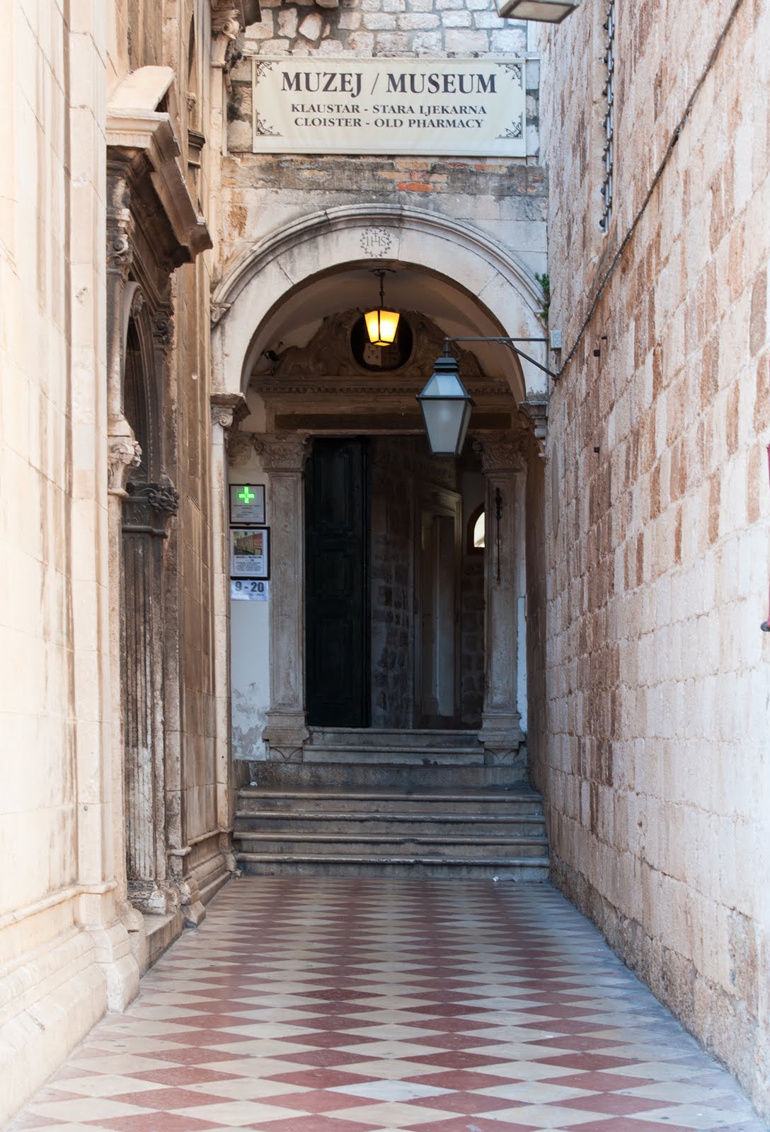
 I am attracted to these alleyway shots as they lead the viewer into the image. This shot has an added intrigue in that there is a door, another favourite allegorical device that I like to use and furthermore the door is partly open revealing a dark interior - lots of story. The portrait works best for me as there is nowhere for the eye to go but deeper into the image. In the landscape version, whilst there is no easy exit, there is no imperative to go forward.
 In the centre of Dubrovnik this civic building flying the flag(s). I think the landscape has more harmony than the portrait version. Though structurally the architectural details are similarly symmetrical in both versions.
 This shot of a balcony works better in portrait, the context provides it with scale and dimension, whereas the landscape version has the balcony almost in free space.
 Stairs are another favourite subject, like alley ways they lead the viewer somewhere. Maybe its the poor crop in the landscape version but the portrait image has as exit at the top right, providing the viewer with resolution through an doorway. There is also a lot less lens distortion in the portrait version to deal with!
 Another stairway shot and again, though not by as much, I prefer the portrait version. There is an exit in both, but the landscape version has a full stop whereas the portrait appears to have an option for further travel. The portrait also has a fuller description of the staircase.
 I purposely composed these two shots without any reference to a horizon or sky so that I could see what difference that made to my appreciation. I am fairly ambivalent about both shots.
Very interesting to read your commentary John. I think you've really pinpointed the differences in effect between vertical and horizontal. My favourite images are the ones of the alleyway.
ReplyDeleteCatherine
Thanks for the encouragement Catherine, the Alleyways is a favourite of mine - the portrait version. John
ReplyDelete