I knew I would need some resource when I went to Dubrovnik and Montenegro and some of the photographs are from that time - about 4 or 5 weeks ago and others have been taken to try and give a broader response to the requirements of the exercise.
I feel confident that I understand the constructional requirements in these exercise but I am acutely aware that I need to do two things:
Firstly to provide more evidence from imagery that has been taken to fulfil these exercises and secondly to try and interweave some narrative into them.

Lines: Horizontal, vertical and mixed.
This is an image I took many years ago and vlearly it is about the twin trees that are alomost at the horizon. The newly worked field has a clear direction of travel to those trees and whilst this is a full frame from a 6X6 negative a better viewpoint (for this exercise) would have been to reduce the sky content and effectively raise the horizon.
 The next image was taken a week or so ago and I had the above image in my mind at the time. I raised the horizon and used the vertical lines lines to draw the view to the horizontal. The twin tress are over the horizon but balance the image.
 The images here uses both horizontal and vertical lines to draw the view to the horizon in the upper shot there are telegraph lines echoing the horizon, whereas the lower image has bolder verticals and horizontals due to the stronger light on the day this was taken
 An alternative image with a combination of horizontals and verticals are these holiday chalets - complimented with orbs of greenery. A very regular structure
Diagonals


The picture above - taken from a dungeon in India has a very strong diagonal, in fact it could be said that there is nothing else in the image, whereas the the image opposite it is more complex with a number of diagonals all competing - I had decided that this was a monochrome image, albeit toned, to help with the visual decoding.


The image of the piece of deadwood was constructed along the vertical, but it could be argued that a more complex construction is available via the "turn" in the wood towards the top right corner. The image opposite has a very strong diagonal light ray from top right to bottom left

This pair of peacocks are perched on the diagonal, both interestingly looking out of the frame.

Newer shots
 The portrait is composed on the diagonal which can be an effective technique for portraits. The landscape opposite has a rolling diagonal which might be emphasised more dramatically with a narrower crop to remove some of the redundancy in the lower third.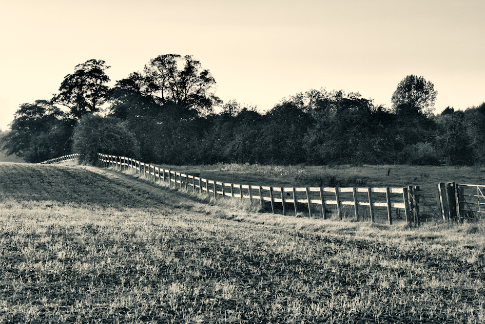
A much weaker diagonal using the fence

This hog-weed head has a variety of diagonals running through it - bottom right to the left third and from that point to various points on the frame edge.


These early morning churchyard shots rely on light rays to provide the strong diagonals; soon after the mist would lifted and whilst it was a nice sunny day there would have been no real opportunity to describe the scene in any meaningful way for the exercise.
Triangles
 The tomb has a very strong triangular structure, but whilst the compositional idea is very obvious the positioning of the tomb within the frame could have been better placed to bring the apex of the window both centrally in the frame and above the casket itself.
Up to date shots

 The bell tower on the left has a clear triangular structure and the boat rope opposite has an implied triangle - or it could be said that the horizon resolves and brings two distinct triangles to the image.
 The hogweed stem has some clear implied triangles even if the edges are slightly curved, whereas the metal framework has a multiple of triangular structures to dwell upon, both implied and actual.
 The grass stems opposite create a couple of implied triangles. The very short depth of field is used to bring forward the construct in what would otherwise have been a very confused image.
The ship's mast below has multiple triangles, implied and actual as well as implied rectangles that utilise the edge of the frame to deliver the

Circles:
 This is another piece of deadwood that I captured some years ago and whilst the image is a little flat it has a clear circular viewpoint.
The hogweed seed head is set in a semi-cicular form
Compositional lines
 This shot, again of the deadwood has a very distinct direction of travel for the viewer to the boat, even the cloud extends a radial point to the boat.


