Showing posts with label Exhibition. Show all posts

Monday, November 21, 2011

Further thoughts from Hereford


Further thoughts from Hereford

George Georgiou – Shadow of The Bear, 2009-10

“Georgiou” had featured at the entrance of the exhibition via Winship's series (they are life partners) and whilst she felt the need to mention his name, the reverse wasn’t offered. The festival catalogue noted “dozens” of  photographs in three series of sequential images, separated by two large prints, which, overall create a link between two countries – Ukraine and Georgia – as they “..come to terms with the future and build a better future.”
So, something like seventy or so photographs. The technical observations I think are worth noting, very few camera positions – about six, maybe seven a wide angle and an aperture that is as closed in as possible, which taking  it all into consideration probably  means a tripod as well. These facets of the imagery allowed the compositional constructs that, to this viewer at any rate,  were important to Georgiou.
The wide angle brought a similar importance to the surroundings as to the people in the shot - the surroundings being as sharply rendered as the people. The people were going about their daily business, shopping, going to work, socializing, courting – just the normal hum drum of life. The settings though gave them a placement – the shot with a banner of a football team, a local shop, a bus stop, an apartment block – all of these are particular references that are important otherwise why place them inside the focal limit. People leave the frame and people enter the frame, but the references remain constant. My initial impression was that this series is about identity – either struggling to hold on to it, or to (re)create one.
I was also interested on the print quality and presentation. I thought that the images were the poorest quality on display, I notice that another student has also commented on that… Anned “… I think its to do with the quality of the photographic finish, that some of the other works seemed so very polished/finished/technically done..” (Anned) found this set the most thought provoking.
I think a lot of work had been undertaken on this set. The colour toning was very consistent across the series and several seemed to be a little “oversharpened” which tended to suggest that he felt a need to keep all the image (and all the images)  “sharp” – in “focus”, equally important. Seeing all the people in the photographs going about their life brought Parr’s exhibition to mind and I wrote the note “Martin Parr it isn’t”. I think Georgiou’s use of a single, probably “tripodded” position, allowed him to melt into the landscape and become more of an observer – not an accusation that Mr Parr would have had leveled at him too many times I think.

Manuel Vasquez – Traces

A very dramatic set of images. My notes verbatim from my notebook:
“comment of social aberration post apocalyptic events such as the Madrid bombing – how people/society patches and mends to accommodate the  previous inconceivable ructions in their daily life.”
The festival catalogue notes “.. revealing the spectacle as spectacular, albeit a dystopian spectacular of the present.”

Two comments: The use of the word spectacular. This word has a very strong resonance in the terrorist vernacular. The provisional IRA appropriated the word to mean an event like the Brighton hotel bombing during the Conservative party conference, the Birmingham pub bombings, and it’s resonant peal was heard again and again during the aftermath of the 9/11 atrocity in New York. The use of it here, in this context, seems entirely appropriate.
The second point regarding dystopia is that we – in the targeted west, continue to accept the dystopia as the new utopia. Post 9/11 we accept the security checks at airports, the continued increased levels of surveillance that greet us at most public events and places.
What I found interesting about Vasqez’s work here was what it didn’t show. The people “in the light” – seemed to acquiesce, look comfortable in the limelight by the lampposts and the contrast was such that it concealed what was in between the lamps. What was lurking? Were these photographs telling us that we cannot illuminate everything, we cannot move our fears completely away. There is no utopia?

Robbie Cooper – Immersion

There has been a lot of comment that I don’t think I can add to. I agree that the people are immersed, I agree that they are isolated. I don’t agree that this is a “new” phenomena – unless in anthropological terms we define as new the history subsequent to the inclusion of the cathode ray tube into the corner (and now wall mounted) of the room. I think if the technology that Cooper uses were available in every decade since the end of the 1940’s he would have seen something similar. Total immersion in the flickering image. Be they watching porn, video games, or Downton Abbey. Watching a screen is a singular occupation for many people – even in sitting rooms and, sometimes in multiplex cinemas. It can be a communal event, but it draws the viewer in. Acorn, Sinclair and Amstrad in the eighties provided onanistic playthings for the ocular senses; which, whilst the graphical content has improved almost beyond recognition the isolationism hasn’t. What might have been interesting would be an image of the simultaneous viewing of a similar screen for comparative purposes.
Note, there were two images of young teenagers  (13 or 14) watching/playing video games that were rated as 18 – which is a completely different study. Good framing and processing though.

Friday, November 18, 2011

People in Hereford

I haven't spent a lifetime making photographs, I have spent a little more than half my life occasionally taking photographs and the older I get, the more I think about the photographs that I have made and want to make more of. I have though, spent a lifetime looking at people. I have lived in a large family house, I have six sisters and a brother, I have worked with teams of people in sport and in my career, and I have also directed people on the stage. I perceive I know something about people. The first photographs that I took were pictures of people, family, friends. These photographs had no pretensions, mostly badly lit (or more correctly, inexpertly exposed), sometimes focussed, sometimes not. The photographs though that haunt my memory, those that have lasting emotional content are those that display people. I mean display and not portray. I mean the photographs that reveal something of the person. Karsh's picture of Pablo Casals, Steichen's photograph of George Bernard Shaw, the Bedford schoolboy outside Bedford prison by McCullin, El castigo from the Etiopia 2007 series by Jaime Mota; I could list many more. 

Portraiture isn't without artifice, the photographer interjects a lump of technology into the face of willing or unknowing or uncaring subject and snaps the picture. The quality of the image stems from the photographers knowledge of the subject and the subject is both the object of the lens and the means of recording. To get these images, images that describe the subject in 125th @ f8, that can reveal even the merest hint of the soul of the subject is the grail that portraitists might seek to set them apart from the daily grind of formal portraiture

I had never been to Hereford nor, consequently, the photography festival. My knowledge of Hereford is, to say the least, basic. Somewhere in the west and agricultural, something about beef cattle and dairy products might come to mind. I didn't expect, when I started to drive to the festival to be shocked, to have my eyes challenged and my emotions stirred as they were - and still are. As I write and check my notes, the feelings that were generated then are still as raw.

Two sets of prints stood out for me and they were those by Vanessa Winship, Geogia 2009 - 2010 and Donald Weber's Interrogations: Big Zone, Small Zone.

Reproduction by kind permission of the artist, Vanessa Winship

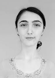
Winship's set of monochrome portraits are absolutely beautiful. Finely crafted prints, with fine technique, any one of which I could gladly have hung on my walls at home, yes, even the one of the young post-operative boy. The images were taken from the Georgia in Progress set and can be seen here  . Georgia is one of those ex-soviet satellites that rejoiced the freedom after the collapse of the Soviet empire, followed by the Rose revolution. The enmity that lies between the Russian state and the Georgian state is almost as old as the ground these people walk on. I remember a radio interview where a Georgian described how some Russians had come over the border and raped and murdered their people and how the kinfolk of the victims sought to avenge the crimes against them. When the interviewer asked when this happened and had they informed the police, could anyone describe the perpetrators, the correspondent said that would be a little difficult as it had happened somewhere in the 12th century. Yet it was told as if it were yesterday. These people who Winship describes as .."And Yet There Is A Kind Of Melancholia, An Underbelly That Almost Inevitably Sets Itself Against Such Exuberance. It Is A Place Literally Crumbling From The Weight Of Such Unsustainable Romance. On My Return In 2008, After A Summer At War With It’s Powerful Neighbour. " (1). The people live the past as if it were the present, I think this is the romanticism that Winship refers to, holding on to a past where the romanticised view of their predecessors are held close to their hearts. No mention was made in the accompanying text to say what instruction Winship gave to her subjects, whether to come "dressed" for the occasion for example national costume, it would be interesting to hear if there were any instructions. I know that for portraiture it is one of the first questions that are asked of the photographer, so I would guess that the subject was covered at some stage. Whilst viewing I heard the name Arbus mentioned in whispered tones, and yes I can see that, but I would be wary not to have the Arbus strap-line of freaks applied to these subjects.

The photographs do contain a certain melancholia, in the way the eyes appear in the close in shots and the way the subjects stand for the full length photographs. It appears they are "straight" shots, no apparent post processing, close to the gossamer of "truth" in both the subject and mood.

I have had a (short) conversation with Vanessa which has resulted in the ability to reproduce the image above and also answered a couple of my questions, these don't alter either my view of her work nor how I understood how she approached her work. Vanessa explained that she asked her subjects to simply look into the lens (which she sometimes pointed out to them) after explaining what it was she was doing and, perhaps in particular the effect of seeing things upside down on the ground glass. Vanessa only made one exposure per subject, she appreciated that it took time to stand still especially as  ".. I would explain that I was going to be a bit slow because the camera is a bit fiddly, and also that I was a bit slow." I asked about the effect of the camera on the subject and Vanessa replied..."In terms of the camera making a difference then I would say more than likely yes, although I think the whole occasion made a difference....I am a stranger, it's an unusual event within the school day, it's not a usual occurrence to have a formal portrait made,( by that I mean to stand momentarily in front of a camera set on a tripod), and yes it's not a telephone camera, nor is it a digital camera." 

On a completely different plane was the work by Donald Weber, where Winship's set was full of peace and beauty, Weber's exquisite beauty stems from capturing a moment and a moment that shook me and moved me. The portraits are of "The Underclass and its Bosses: Crime and Punishment in Ukraine,...". There are many literary connections to this body of work, Weber himself talks of Solzhenitsyn's Gulag Archipelago, which I haven't read in over thirty years, saying "Solzhenitsyn talked about the moment of recognition, he always wondered during his execution what he would look at, would he look up at the sky and look for a bird, or would he look down at the ground, head bowed? It's about a moment of recognition, once that flicker of acceptance occurs, things undoubtedly change. So I was looking for these moments, that passage from knowing what was once will never be again." (2) We can see these interrogatees looking, maybe not for a bird, but surely for divine intervention.

What I also remember about the book is how Solzhenitsyn likened the proletariat to rabbits - and not in the likeable fluffy version. These are portraits of human rabbits staring at the lights of a brutal power in the manner of supplicants. In every shot where the subjects hands are visible, all but one are in a pose of prayer. These will be Orthodox Christians, they are praying for mercy. Weber states that they aren't in a religious confession.. "but there is that idea of purity of confession, that one fleeting glimpse of honesty. That's the moment I found so interesting. It's the closest any of us get to God, and the moment at which everything changes..."(3) Let me be clear, I have no God, I subscribe to the "Gospel of the Flying Spaghetti Monster" by Bobby Henderson - no less serious, despite it's title. Dostoyevsky wrote Crime and Punishment, he was Ukrainian, maybe that is why Weber chose those words, most people fail to make the distinction between Russia and Ukraine (unless you are Russian or Ukrainian that is). Dostoyevsky wrote about the failings of the human condition, about nihilism versus religiosity and in particular of course the Russian Orthodox church. It (religion and the process of confession) is used as a metaphor in the book. I wonder if Weber is referring to this in how he has edited the series. And the final literary reference is to "The Kolyma Tales" by Shalamov that describes life in the notorious labour camps of Siberia and is equally shocking as Weber's photographs, not least because the graphic imagery comes from the readers imagination. I don't think this set panders to the prurient (though it may do that as well), nor do I think that these images or similar shouldn't be shown, just because they shock, they certainly did that for me. I think it is important that images that offer a truth, and here I go back to Weber's words, to the .."fleeting glimpse of honesty.." should be shown. Weber, in this series has given the viewer a real truth in the very pained, clutched and desperate - but who wouldn't be with, what looks like a Tokarev, anointing your temple? And truth, real unexpurgated truth, is a rare commodity in any medium, let alone and perhaps least of all, photography.

These two photographers allow the viewer to grasp a sense of honesty, all be they framed in critically disparate circumstances, one confident that their past informs their present and their future in equal measure and from generation to generation, the other that the past has informed on them and that there may be no future as a result. Both sets edited to draw, at least from this viewer, an emotive response that I am sure will last long in the memory. The one printed to deliver a haunting beauty, the other with a concealed spectre of a wholly different kind

(1) http://www.vanessawinship.com/gallery.php?ProjectID=175

(2) http://colinpantall.blogspot.com/2010/11/donald-webers-interrogations.html

(3) Exhibition catalogue

Tuesday, November 15, 2011

Into the light

A few days to go before the exhibition opens, most of the preparations are complete, we will shortly only be in need of people, the baying public.

It is a curious thing to exhibit one's work, the mix of feelings that come, I suspect, to all practitioners notionally in the visual arts; the need for recognition, the fear of failure, will anyone come and if they do will they buy anything?

I suppose school was the likely conditioning that has allowed me to expose myself; the photo of me, on stage at the age of - I'm guessing - 7 or 8 in a (now non-pc) variety Christmas show is the first record I have  of being in front of an audience, I sang and danced solo and enjoyed every minute. My first exhibition of photographs was suggested to me by the proprietor of the camera shop in Banbury where I bought my film and paper from Blinkhorns ."Thomas Blinkhorn established Blinkhorns in 1883. He was a renowned portrait photographer with a busy studio at our current premises. The business has passed from father to son through 4 generations and has become the leading independent retailer of audio visual home entertainment in North Oxfordshire..." Martin Blinkhorn, now deceased, was, apart from being the then proprietor a photographer with the RAF during the war and subsequently a lecturer in art and photography at Banbury college, the same college that Michael Kenna studied at, I wonder... Their premises are quite long and have space in the rear of the shop to listen to hi-fi and I was encouraged to hang my prints there and through the body of the shop. I sold about seven prints, I was amazed, up until then I would have given them to anyone who might have hung them. The shop is now run by Tom, the son of Martin and I thoroughly recommend them to anyone who might want good advice about audio visual. Plug over.


I have been selected for several "Salons" where my prints have been exhibited and have been published in several books and the B&W magazine selected some prints a few years ago, but other people are involved in the management of these events or publications so it wasn't until I had to work out how to "put a show on" that I realised the effort, cost and exposure that is involved. It is, though, exposure that is key here and this comes down to selection, what to expose myself with? What and who do I think my audience will be? What do I want the people who come to the exhibition to take away (apart from the stock that is!). I am now a regular participant in Oxford Artweeks which is a completely different project to the upcoming event and I am sharing the space with three other artists, a watercolourist, a textile worker and a jewellery designer in a hotel that has advertised the event in it's blog. Dealing with the hotel has been an altogether different experience in that they expect me/us to contribute to the "marketing" of the event. A banner out side the hotel, media that they can use in their mail-shots and blog entries. Internal signage to point the public the right way. Most of these have been relatively stress free, but dealing with printers for my own work - I decided to get some calendars and cards of my work produced has been more unsettling. I have no recommendations there I'm afraid, but this may be down to naivety.

Which leaves print selection. We have two spaces in the hotel and I have decided to split my work into local "The Dorn Valley" and "other". I published a photo book via Blurb called The Dorn Valley, which is selling (albeit slowly). The downselect process, there is a current weareoca blog about editing that is in the back of my mind, but I don't think for this event I need concern myself too much on that score. It is commercial success that this is about, I'm down nearly £400 so I need to sell! For the course I have been focussing on imagery in the area where I live, Middle Barton is in the Dorn Valley, so I have some new photographs to show as well as "firm favourites"
This (left) is definitely in the latter section, I've sold this a few times at A2 and hope to again (it'll make a nice dent into the debt - I now know how the Greek finance minister feels). It is of Dovedale, for those that know it, directly to the side of the "stepping stones" for those that don't, never mind.
The image (right) is from the core of our village and again it has been sold quite a few times and it resides on the walls of a few people in and out of the village - I've only ever printed this at A3+, but it is an image of part of the village that hasn't changed in a century or more. The twin "letter box" images below, have come from recent forays into the village surrounds - both are on the Fleming estate to east of the village, highly stylised, but then most of the work I have done in and around the village suffers from that accusation, they being monochrome works.
There isn't space or need to show all the images that will be on display, there is a set on "snow in the Barton's" taken over a few winters and boosted by last years "dump" and quite a few others.
The interaction with printers has been a revelation. The banner couldn't have been easier, I generated a pdf, sent it off they printed it and at 4 mtrs X 1 mtr it seems to do the job. It's been situated outside the 


hotel at a busy junction for people who are coming to or going from the villages in the area, so hopefully it will attract, we put it up two weeks before the event. The calendar was another matter; they two asked for pdf's, which a duly supplied, they very quickly sent me proofs - which a rejected, due to a magenta cast across the all the images and a very unflattering cast to the cover shot. they reproofed and after some time and a few phone calls resent the proofs, still no good. I then sent a set of tiff files, which they rejected and asked for CMYK files. More proofing and finally the calendars were printed and delivered - not as good as I had hoped for. The cards - a sub-set of the "snow in the Bartons" set were really quite badly printed, but as they explained their printer can't do any better - only lighter or darker, they will clearly not be printing anymore of my stuff in the future. I need to seriously reconfigure how I work with professional printers. I suspect they consider me Joe public and as such give me that level of service, but I need better printing.

The whole process has been very different to the previous experience. For Oxford Artweeks the promotion and management is largely done by the organisation. As artists we need to find a venue and then pay the entrance fee to Artweeks and that's about it. Organising and promoting my own event has been a different matter. I do like exposing myself - yes I am aware of the connotations - but I feel this is the process of exhibiting. The thought of parading your work for scrutiny can be an excoriating experience, but the act has been a much more rewarding experience. People are generally pleasant, so it unlikely that there will be any blatantly obnoxious remarks, but the validation will come about with sales - people will need to want these photographs on their walls at home - or donated to other homes and that is the judge of success at an event like this. Another really difficult test is when someone starts to ask you about the work, this exposes the artist - certainly it has done to me - in a way that demands that you try and communicate what the reasons behind the photograph, why monochrome, why there, why then. All difficult questions, but it is the most beneficial part of the process, the part that I look forward to most, to allow the photographs to expose me, my motivations and face my demons.

Saturday, October 8, 2011

Glamour of the Gods

At the National Portrait Gallery, and other thoughts.

Formal portraiture is a difficult genre to pull off well, perhaps no more or less than any other genre, but nevertheless the formal portraitist has something to contend with that a landscape photographer doesn't have - ego and emotion, and these aren't necessarily only confined to the sitter, because to make it work the sitter has to deliver at the time of shutter release. The sitter has to provide the artist something to work with, something indeterminate that a formal portraitist, that works in non - photographic media - paint, pencils etc, can work without for large periods of the creative process, as long it becomes apparent to the artist at some stage then it can be integrated into the study, whereas the photographer has to generate an emotional charge between artist and sitter - something has to happen between them.

The "Glamour of the Gods" show at the NPG has formal portraits of, generally (I can think of one exception) actors and actresses that "want" to project, who "want" to deliver and find a relationship with the lens, the photographer and the viewer as without it they are redundant as performers. Greta Garbo had a difficult relationship with the camera and is the only exception I know of with the "stars" of "pre-war" Hollywood that this exhibition is all about. I will, however widen the scope of this entry to include other formal portrait photographers that I have some awareness of - which may limit the breadth of the entry!

I suppose my entry into this genre stems from a strong regard for film noire, watching old black and white movies as a youth, my own predilection for monochrome work and I have loosely studied this genre for a few years and started some projects of my own which I may refer to later in this entry.

The exhibition in itself was interesting and varied (inasmuch as this sub genre can be varied) and enabled me to look closely at the print quality that so far I have only seen from reproductions in books. Overall I would say that my prejudices were confirmed and it was wonderful to see these iconic portraits in the flesh, as it were.

                                                                     George Hurrell


George Hurrell's work stood out as I expected it would and showed an artist and craftsman at the peak of his ability and his iconic images of Shearer, Crawford, Bergman, Harlow were every bit as beautiful as I had come to know. Whilst this isn't a comment of how Hurrell came to be one of the leading studio stills photographers it is likely that I will return to his work to illustrate his technique and how others adopted similar working practices in the furtherance of this medium.

When I first started to look into this genre I didn't notice how expertly these portraits of the stars had been worked, how they had been retouched, maybe that's a naive position to start with, after all it's called "photoshopping" now. But when I researched it a little some years ago I found to my surprise how much retouching had gone on. And, as always, once you know its there it's difficult not to notice it anymore. In the first couple of decades of the last century the technical quality of retouching was relatively weak and the photographer relied on heavy diffusion to disguise he imperfections of their protege stars and starlets.

An exemplar of this retouching technique is shown below.


The twin shots above have become common currency in the discourse regarding touching, however it is still interesting to see how far the studios were prepared to go to create the illusion of what they considered perfection, for that is what Gods are. Joan Crawford's face becomes devoid of wrinkles, lines AND freckles. Hurrell would ask that his sitters wear little or no makeup when coming to him as this would enable him to work things more efficiently.

These techniques were applied to both sexes and as the technical capabilities and craft improved both genders received higher levels of sophisticated retouching and whereas the male stars generally fared better it did become completely over the top in some less than capable hands by the ends of the 1930's and early 1940's. The universal process or retouching largely died out after the second war as the studios went for a more "realistic" look but is now is as pervasive as ever with Photoshop and the star machine working as hard as ever.

I'm undecided about the moral and ethical issues at work here. Clearly there are victims here, but it isn't necessarily easy to work out who. The stars? The viewing public? Impressionable youth? The impressionable?

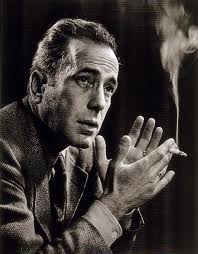
Humphrey Bogart

Hurrell's technique developed over several decades and used quite dramatic lighting and was said to have said "it doesn't matter where the light falls, it's where the shadows land". But the whole process of star making changed after the war and with it went the 8X10 cameras for a more convenient camera capable of more shots more conveniently, allowing for more mistakes with faster emulsions, that delivered finer and more controllable grain and wider tonal range. In came colour and whilst Hurrell adopted it, the effects that he had created, along with the others of the pre-war era were never quite re-created (in my view).

Norma Shearer                                                                                  Jean Harlow


Norma Shearer gave Hurrell his first big break and there are a lot of Hurrell/Shearer shots and he loved photographing Harlow also, almost as much as she liked having her photograph taken.

I've placed an alternate portrait of Bogart with one by Yousuf Karsh. I think there is a great similarity in the projection from the print,. The portrait of Pablo Casals is a far more enigmatic pose. Hurrell wasn't about delivering the soul of the sitter, more mystique, Karsh, who by the time he got to photograph Casals was able to pick and choose his subjects and, to some extent, dictate the delivery style.

‘I decided to photograph the master of the ’cello from the back, in a partially restored abbey in Prades … lost in his music. For me, the bare room conveys the loneliness of the artist, at the pinnacle of his art, and also the loneliness of exile.’ (Karsh)


Prades is in South West France and Casals appeared there as a regular during his exile from Franco's Spain. If the viewer is in the North then the light would be coming from South West - Spain, an interesting thought. I've seen a print of the Casals and others by Karsh in the hotel in Ottawa where he had a studio for many years. That are very impressive in size and ambition.


Some views and my own interpretations:


Rebecca, left simply shot on a diagonal flow, with a single tungsten lamp above and left, creating a strong shadow, the image on the right is my take of the Louise Brooks portrait by Eugene Robert Richee, itself inspired by Aubrey Beardsley's pen and ink work (something very familiar to me from student days). Again a single tungsten lamp this time high and right. I have to say that my piece is far too fussy.

The images of Lisa were drawn from the stills of Hurrell and my attempts to add a dramatic element, as if from a film set - these Hollywood stills photographers had just a few minutes between takes to create their publicity shots and sometimes seconds!

Unlike the shots of Rebecca these were digital captures as I wanted to start to develop my re-touching skills (I also took a large number at the same session with film). Single tungsten lamp. The shot left has a Hurrell Crawford shot in the back of my mind and the opposite image has a Shearer shot where Hurrell brought her legs into view to prove that her concern over "my legs are one of my worst features" could be shot to her advantage.

Madeleine was a ballerina with the Royal and has a very significant photographic background, her father, a professional photographer, pioneered Kodak into the UK. Together with her husband, also a professional photographer combined to have her posing from the age of 3 (she didn't tell me this until the first posing session! No pressure there then!).
However, whilst the shot left, taken with a 6X6 on Ilford Delta 100 - no orthographic film for me, that laid the basis for Hurrell's early work and reputation. The second shot is from a series where I attempted to recreate some of the glamour practices from todays photographers, so digital and a lot of re-touching. I worked very hard to eliminate any wrinkles, lines, imperfections that would be anathema to today's photo stars. The link of course is that Madeline has a direct connection both with the era from which I draw inspiration - I have seen her portrait with Danny Kaye and others from stage and screen with photography being the another connection

Friday, October 7, 2011

It's all about the money

Post Modernism at the V&A


The highlight (for me) of the exhibition was the photography hall, it displayed a relatively few, but widely varied images from the period 1970 to 1990. The introduction mentioned three categories of parody/appropriation; Nature and artifice and lastly Tableau (though it was described differently – I hope I haven’t misinterpreted).

Haywain by Peter Kennard.

A depiction the Haywain by Constable with a cruise missile launch system transplanted onto the Haywain itself. The background image is a copy-print and has a monochrome/black and white delivery (there is a colour version). The image itself  i.e. without the interjection of the cruise missile – which was as much about the MoD’s beautification of the missile – could have played a Po-Mo part inasmuch as it is a clear devaluation of the original, cloned for the popular consumption in a consumer age. Constable for the people, re-packaged for a monotonic bijoux dining room?? The addition of the cruise missile added a dark humour and a political sub-text missing in most other pieces on show, both in the photographic hall and the main exhibition hall.

Carrots by Shrigley


A strategically placed carrot seed packet, clearly set at the end of a drill in and amongst some cacti in an otherwise arid desert or plain. These root vegetables need water, cacti don’t, the sun was burning down, the carrots won’t survive – the art is therefore ephemeral; a disposable item in this new consumer age. See later.


Canned Sunset by Keith Arnatt. Ostensibly the author takes discarded items from waste tips and rubbish and finds beauty in the abstracted artifice. This picture was a discarded tin can, lit and placed in what appears to be water, but could just as easily be effluent. There was another large print of waste in water that I didn’t take note of that used highly saturated colours to almost romanticise the discard of our lives.


Sarah Jones – The dining room


This picture I thought was meant to be funny, wry, ironic and worked at those levels for me. Three young females – mid to late teens – situated in a very formal, dining room. The formality of the décor, proportioned prints on the wall, a mantelpiece decorated with the trophies of staid middle class life. The dining table highly polished and pictured centrally on the table and lit quite brightly was a willow pattern china tureen that seemed to occupy the focus of their collective emotion. Two of the girls looking at it, with what could be described as disdain, whilst the third girl has her head on the table face – down, in a pose of exasperation. This was a carefully staged production. These three girls effectively saying this paraphinalia has nothing to do with me/us. Why are we here? "Beam me up". And yet this solidity of surrounding held them there. This “old – world” with different values, different histories had no relevance to the world this new generation were a part of – their clothes were of a different generation, colourful - not Post-Modernist, they hadn’t interjected any irony into their view of life and how they present themselves – they just wanted out, back to their future - were they, in fact, being "protected" from what they wanted? The image comes from a series of similar scenes using the same girls, but in different positions.

Jeff Wall’s “outburst” tableau – not on the surface a very worthy piece – need to consider further

Claire Stoppard – Scene’s of a struggle.

Like so many visits to exhibitions I started it the wrong end, not on purpose, it’s just where I seem to find myself, like a habit, and again I found after I had viewed the series I turned up at the start to then read the introduction. A dozen or so images that were carefully printed to look like working documents, not pieces of art (at least not treasured art), where placed in a line along three sides of the hall (at one end of the short hall). These black and white images where clearly meant to depict scenes of a crime - whether it was the same crime we didn't know, that was for the viewer to determine. I understand, but have never seen any to comment with any authority, that there are a lot of “forensic police” serialisations on television - CSI -  and these shots may have been influenced by them. Dispassionate shots of high contrast “scenes” with circles and arrows (reminds me of Alice’s Restaurant by Arlo Guthrie) depicting evidential data for us, the viewer to consume. And I think this was the point. We were participating in one of the by-products of this new consumer age. Here were items specified, depicted, highlighted for our attention, itself an ever decreasing commodity these days, so that we didn’t have to dwell on the image too long, we, the viewer, were presented with arrows directing us to the solution. Like a modern day police saga where the science convicts the criminal with just a few particles of evidence. The viewer is served up with the incriminating evidence and can move on to consume something else, maybe with a bit more juice next time? This then wasn't irony, not humour, this was an indictment on society and a relevant one, possibly more relevant that anything in the main exhibition.

Cindy Sherman – transformation

I was glad to have seen a couple of Sherman’s pieces - this one is in the main exhibition, but there has been so much discussed and written about her work that I found very little to add. About transformation, about the shallowness of image within culture today and most certainly Post Modernist with wit and an extremely accomplished delivery.


Karen Knorr’s “work of art” – constructed as a piece of classical/proper art. The image on the left is a hair grip and the left is a pair of tweezers.

The card on the left reads: Hair Clip. Used to secure hot curlers in the hair. Rollers were electrically heated the applied to the hair, which was scorched into temporary curls. British c. 1980's

The card on the right reads; Tweezers.  thought to have been used for the removal of hair ... (I didn't note any more down - but you get the gist). This might have started as an exercise in typography, it is certainly a deadpan delivery, maybe there are more in the series - I liked the prints, I'm not sure about the wry commentary.


James Welling Platinum/Palladium. I was probably always going to enjoy this. The classical processing of a installation designed to show off a piece of objet d'art, minus the piece of objet d'art! The work involved to create a Platinum Palladium print – especially if one considers that route the artist has to take to gain the skills to be able to create a print like this AND THEN not use it to present an object, but to exhibit its absence, it’s presentation mount of velvet, which interestingly is a perfect material to deliver the Platinum/Palladium’s graphic capability. Nice one Mr. Welling.

Richard Prince – Cowboys. Another iconic photograph of the genre – and already having an ocean or words recorded in its wake.


There are a lot more photographs in this hall and some more in the main exhibition.


The rest of the exhibition.

I found it absorbing on one level and disappointing on another level and finally revelatory I was disappointed in that whilst I found a few pieces that I thought beautiful, the sketches for the “Best” store, the 3D work in wood and some, but not all, of the Kitsch tableware I didn’t come away feeling inspired about anything. I did come away feeling that I “got-it”; but I’ll come to that later.

There were a significant number of references to classical art, columnades, scrolls found in two and three dimensional work. There were also a number of Art Nouveau references, especially around the furniture pieces and homeware; for example the chest by de Bruyne(?) – Art Nouveau meets neo-classicism?!?

Fill the space! I also thought that the artists were determined to give full value for their art commissions.  Gehry’s house for example left very little space, it was his own commission I believe. It appeared as if he felt the need to deliver no space, negative or otherwise – he used it all up, filling the voids with construction as if it were all an opportunity to demonstrate his ideas.

Ad-hoc assemblies. There are a  number of “ad-hoc” assemblies, for example a “sound system” with speakers, a record deck and I assume some kind of “deck” with a guitar built in. This was clearly an assemblage with no utilitarian value, it’s point was to reflect the consumer need against the jetsam of everyday life. Whereas the chairs/stool were “crafted”. They could be used as stools  - no-one was allowed to do a weight check, but they looked more than some insubstantial creation - one piece didn’t look very comfortable but nevertheless they appeared functional. The trembly table didn’t look scared!  But it did have shapely legs – see picture below. Note the use of ironic colour (I'm being ironic here).

The sketches for the “Best” outlet were beautifully crafted – needing to depict the “installation” correctly for their client, this despite their patron being a generous benefactor for the arts.

And as we near the end of the tour we get to “Money” – to Martin Amis’ quotation about money having no morals but before I move to that I wanted to mention Takamatsu – whose beautiful images of utilitarian “machine-like” buildings, seemed less about Post Modernism and more to do with architecture mirroring the society and civilisation it was to end up in – I am sure I am missing a very big and blunt point with his work, but for me there was no irony in the art, there may be fun with the ornamentation. I did however admire the draftsmanship and wonder whether they existed before "Blade Runner" or did it (the film) influence Takamatsu?

Then……..”protect me from what I want”. Whether this was the point the curator wanted to project I'm not sure, but my overall takeaway from the main exhibition was about consumerism, about the way in which these artists had either followed the money or had tried to lead the way towards it. I didn’t feel the quelling of the old order – sure there were a lot of “ironic” references to prior movements, but irony is a weak tool when used continually and I didn’t really see any other device in the main exhibition to warrant a strong PM theme. There was a strong use of colour throughout, quirky ideas not had little functional value, but I saw no “brave new trajectory” more an assimilation into a Thatcherite grab for cash. Follow the money. 


Wharhol

Post Modernism may have started in the 1950’s, it may have had a natural reaction to some of the societal utilitarian injusticies built in the name of “social solution” from Le Corbusier and others, and so it should have. But this collection of pieces had no political comment that I could discern, no fight against right or left, no search for a new way other than lucre.
Who was the spirit in the machine whining for protection against what they wanted? Or was that one last splash of irony tempered by the one piece of truth I found, Amis’s view that money has no sense of right or wrong, it doesn’t care what we call it, it doesn’t have any morals and I found few to see at the exhibition.



Sunday, September 11, 2011

Notes from 3 exhibitions. Friedlander, Day and The Hungarians


Three shows when I only anticipated two – thanks to Miriam, who had spotted a Corinne Day show close by the Friedlander, that we fitted in between the latter and the Hungarians at the RA.

Lee Friedlander

The Timothy Taylor had two bodies of work: America By Car and The New Cars 1964. Typically (for me) I started to view the prints from the end of the show and worked backwards – this has the drawback of not getting the notes surrounding the images at the appropriate time, but it is something I’ve also found to be a benefit in that I’m not preconditioned to respond in any way. The America By Car series has been well documented so I wasn’t surprised by the structure of the prints and my initial reaction was that Friedlander, it would appear, has come from a background in “fine art photography”. 


 Lake Louise


The images are generally well processed, quite sharp - as you’d expect from the equipment he used - and fine grain monochrome. I found it interesting that in a number of the shots there were snatches of he great American landscape – the Tetons, Montana, which suggested a connection between what this series was about and the tradition of Adams, Weston etc., something that I might look into later. However I also thought that the technical quality could have been improved with some spotting and cleaner processing.


The “America” series relied on a very limited set of viewpoints and (most of them) had a dynamic composition that moved the eye across the image in a natural way. The compositions being:

            Across from the drivers position to incorporate the wing mirror, side window, the top of the driver door (at the base of the window).


            Through the passenger window, with a similar construct as above.


            Through the windscreen, slightly to the right of the steering wheel.


            Straight out of either the drivers window, or the same again through the passengers window.


The mirror – in some shape or form - appeared in all but about six prints. The mirror is a very creative device and can be used to deliver all sorts of information, messages, allegories and I’m not sure whether the mirror is there because of the angle of view, or whether it was deliberately placed in the frame. For some of the shots the case is clearly made for its deliberate inclusion with either Freidlander looking at us looking at him and, when another person is captured clearly moving into the frame via their own reflection. Other mirror inclusions had a blank screen and at the moment I am undecided on this point.
Quite a few of the images had a deliberate inclusion of text, from various signs: road signs, hotel signs, entertainment signs, religious signs which all invite us, as the readers, to conclude and propose a context for the images.

The America series focused on America, the land and the people – more specifically on the “blue collar” life – there were no privileged situational shots. It was trucks, trailers, parking lots, shopping areas, seedy bars and almost devoid of people – there were a few, maybe five or so, that featured people.

Movement, the lack of it, was another key element in this series. The “Car”, being the tripod to ensure both that the shot is not suffering any camera movement is used to ensure the view is clear. The camera is static, the subject is static, the monumental exteriors whether they are mountains, parked trucks, building’s and even the very few people seen in the shots are static. It is therefore then a record of a time and space as seen through a car window with the car not performing it’s function as the emblematic consumer product that typified the American dream of freedom more than any other product in American history. And it is Friedlander himself who provides the only movement in the 192 prints in the “America By Car” series. It is he alone, in the parting shot entitled “Lee”- a self-portrait of Friedlander, looking into the “Car”, at us, the viewer, that by pressing the shutter release cable with his finger, reveals the only movement. And he must surely have known that would have done so, he would surely have seen that in the negative and the print that he used as his parting shot for the series.

My overall impression from the “Americans” was that it may have started as an accident – a shutter released whilst getting out of a car, which produced serendipitously both an interesting composition and a reflective image, both from the detail within the frame and with the inclusion of the mirror – but it sparked the generation of a body of work that reflects personally on the USA. The use of a car perhaps emphasizes the continual transience of that society at that time, is still relevant today. There were 192 prints in this set which all seemed to be saying the same thing; taking the viewer to similar uncompleted resolutions, similar ambiguities, similar unfinished puzzle and relying on the viewer to conclude.

The New Cars.

Again I started the viewing of the set from the end of the show and worked backwards. My clear impression as I did so was that this series, whilst it featured cars, had nothing in common with the other set. It recorded the car in its environment, bringing it to the fore and setting it in the background, but always the automobile and it’s position within the society was the key to the shot. No mirror shots this time!
It therefore came as no surprise that this set was a commission to produce accompanying pictorial content for a magazine featuring new cars for the current year 1964! Well, despite, the editor spiking the shots which weren’t seen for many years, Friedlander succeeded – well at least as far as I was concerned. The images often sublimated the car within the environment using various devices such as a reflection in a shop window (where he sometimes included himself) or behind a stack of used car tyres. But it was the “Car” that provided all the context and reference, whereas in the previous series it is often left to the viewer to provide the context and reference – based on signage, what was in the mirrors or what was outside the automobile. This advertising set succeeded to portray the car front and foremost, even when sublimated and the editor seems to have missed an opportunity. The series seemed to suggest that the “Car” was an integral part of the community; it’s physical presence and it’s spirit is omnipresent in the life and culture of American life and when there wasn’t one “car” in shot there were multiple cars.

There was less to bring to this series than the “American By Car” series and its substance was less for it.


http://www.galeriezander.com/de/artist/lee_friedlander/works

Jan's blog entry for this which helped me locate some images;

janfairburnoca.blogspot.com/2011/09/lee-friedlander-timot...

I certainly felt challenged by these prints, I wanted to question almost all of the "America by Car" set and to that extent it was a worthwhile experience.

Corinne Day

The Face at the Gimpel Fils Gallery.

The exhibition had twenty prints taken from Day's work with "The Face" magazine. The images are of Kate Moss in the main and I think reveal nothing about Day - they were in the main fashion shoots and therefore say more about the model or the clothes/lifestyle; which in turn says something about Day in as much as she hasn't imposed herself on the image. With only twenty shots it is difficult to draw any conclusions. So I didn't.


The Hungarians

The exhibition at the RA covered Hungarian photography from most of the last century – with a copy of Kertesc’s “The Boy Sleeping” his oldest know surviving print. My initial impression is that whilst these photographs come from a very wide time period (in photographic terms) it has been curated to depict a common desire for pictorial images. Whilst there are significant number of surrealist images there isn’t a hint of post-modernism. These are photographs from the pictorial school, it’s a take-away exhibition, very little investment is required from the viewer as the photographer has provided the context the references (maybe in some cases too many, I’ll come to that later) and delivered with very high quality – I took away the print book and I have to say that I’m slightly disappointed with that as the print quality is about a grade, to a grade and half short of the real thing – I suppose cost is the issue.

As I consider the range of images on show I’m thinking that photographers on the course could see virtually all the aspects of “The Art of Photography” in one place, barring the colour work! The essential compositional constructs covered in the course are all in evidence, lines, points, diagonals, triangles and narrative. People and Place is similarly covered with bold coverage of urban, rural, war, nude and fashion all covered – though the curator of this exhibition could have had a wider nude content, but that is a mild criticism. The counter to all this is that a good deal of the images would have subverted the course’s early instruction with compositions that defy the ordered structure of the course, but that is a conversation to be had at a different time.

The work by Brassai is very impressive, the scale of his ambition matched by the ambitious scale of his photographs, the “Festivities in Bayonne” and “Meadows in the Isere Valley. The decision what to include and to discard must be very difficult and whilst “Bijou of Montparnasse” below left and the “Prostitute Playing Russian Billiards” were included but there is a significant body of work that seems to have been omitted such as the nudes and the homosexuals – below.


Bijou of Montmartre, 1932 (gelatin silver print)
Brassai (1899-1984) Bridgeman


Kertesc, perhaps the “father” of the Hungarian school of photography is perhaps my favourite of these photographers on show, he prided himself on recording his subjects – not leaving his “signature” on the image, except by its absence. He was never formally taught photography and after a hesitant start he set a trail that most others have followed. It was Cartier-Bresson who said “whatever we have done, Kertesc did first”.

 The opening print – Kertesc’s oldest original print “The Boy Sleeping”, composed on the diagonal, with triangles, implied triangles liberally sprinkled on the image and this is before he decides to make a career out of photography. “The Lovers”, which seems a very intimate shot for an amateur was again shot before he uprooted to Paris in 1925 ten years after he took this, when he was a serving soldier. Simply composed on the diagonal in much the same way as the photograph above left.


It was after he got to Paris and before he went to America (to escape persecution from the Nazi threat) that he performed his most daring and adventurous photography that others followed in his wake. Keretesc’s work with surrealism and other modern art movements in Paris paved the way for Brassai et al.
I found the print “Elizabeth and I” the most poignant and he has several versions of it the full length version:

 and, for me, the most telling:


Moholy-Nagel and Munkacsi are both well represented as well as a significant number of other photographers. Whilst several of Robert Capa’s images are now very famous I am troubled by the staged manner of some of his photographs, especially “Drinking Tea at the Refuge” London 1941, but his “Woman Who Had a Child with a German Soldier, Being Marched through the Street” Chartres 1944 is a frightful image.


As I have said earlier, this is a take-away exhibition. It seems unlikely that the viewer would not come away with something from this show and probably a lot, the range of images, the different print techniques, many differing sectors of the photographic art-form are all represented.


 I enjoyed this exhibition enormously, the variety, the substance. I felt at home and comfortable with the genre.