Wednesday, August 24, 2011

Vertical and Horizontal frames

A series of images taken in landscape and portrait of the same subject


A detail shot of an old town called Kotor in Montenegro. I think the shot that works best is the portrait version. Both shots divide the image in half and probably could have both been composed more sympathetically.


I like both of these shots. The portrait divides the image into three parts with each having equal weight. The upper part has the tree almost bowing to the tomb. The landscape version, suffering more from lens distortion, but also benefitting; the line of the church roof meets the intersection of the cross and linking the theme, connecting them as one., which I can only presume is the intention of burial in consecrated ground.


 I had been looking for cypresses in the landscape as they offer a natural conflict in the capture of the landscape. I think the portrait version works better in this pair, though I have others where the reverse is true - they have more cypresses in those shots.


 I originally looked at this scene to extract a"diagonal" and the landscape version would have been the version that I would have chosen. There appears to be a queue to take to the staircase and as there is a person at the bottom just exiting the image maybe they are only allowed one at a time. Whereas the portrait version the scene is completely different, the group has crowded together and seem disinterested in the climb down. I like both for these different outcomes.


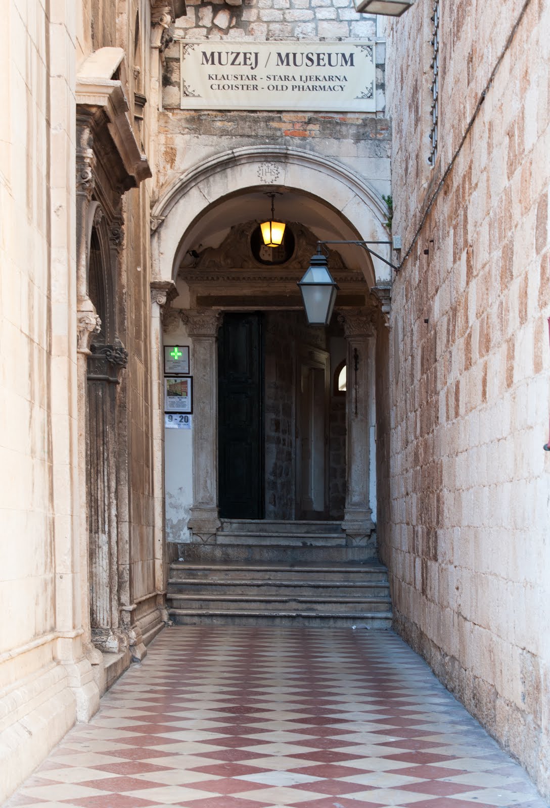
I am attracted to these alleyway shots as they lead the viewer into the image. This shot has an added intrigue in that there is a door, another favourite allegorical device that I like to use and furthermore the door is partly open revealing a dark interior - lots of story. The portrait works best for me as there is nowhere for the eye to go but deeper into the image. In the landscape version, whilst there is no easy exit, there is no imperative to go forward.


 In the centre of Dubrovnik this civic building flying the flag(s). I think the landscape has more harmony than the portrait version. Though structurally the architectural details are similarly symmetrical in both versions.


 This shot of a balcony works better in portrait, the context provides it with scale and dimension, whereas the landscape version has the balcony almost in free space.


 Stairs are another favourite subject, like alley ways they lead the viewer somewhere. Maybe its the poor crop in the landscape version but the portrait image has as exit at the top right, providing the viewer with resolution through an doorway. There is also a lot less lens distortion in the portrait version to deal with!


Another stairway shot and again, though not by as much, I prefer the portrait version. There is an exit in both, but the landscape version has a full stop whereas the portrait appears to have an option for further travel. The portrait also has a fuller description of the staircase.


 I purposely composed these two shots without any reference to a horizon or sky so that I could see what difference that made to my appreciation. I am fairly ambivalent about both shots.


Assignment 1 Contrast

I'll start and end with a contrast, the primary one not having been specified for this assignment. I have just returned from a trip to Dubrovnik for three days and then to Montenegro for 7 days. The duration isn't the contrast.


The contrast is pictorial and slight and whilst this is not entirely the best of comparison shots, there is a vital clue barely discernible on both shots. On the left is an Orthodox Church in Kotor, a beautiful old town on the Bay of Kotor in Montenegro. On the right, a detail from a Catholic church in the equally beautiful city of Dubrovnik, situated in Croatia. There isn't a great deal to contrast these two shots, they are both places of worship, they both have flags that have the same colours - albeit arranged differently; but crucially, with differing central Coats of Arms or insignia. That is the only material difference and the contrast that stems from it is a deadly one.


Reminiscent of that early Bob Dylan song "With God On Our Side", these two nations, along with most of the failed communist state of Yugoslavia were pitched in a wretched war and the Monument (left) that I found outside a very small fishing village in Montenegro bears testament to the futility and waste of war. It is the sheer volume of life extinguished from such a tiny community that I found abhorrent.

The photographic poignancy of this for me is that the upper right plaque refers to the Crimean War dead from this speck of humanity in the Balkans and it is, of course, from where Roger Fenton "the first war photographer" took those early images. The inscription (vertically in Cyrillic) to the left on the monument  translates to "Died For Freedom". Plus ca change.


_____________________________________________________________________________

All these photographs came from the few days I had in Dubrovnik and Montenegro; that's not what the holiday was for, however I used the opportunity to resource the images and discipline myself to try and fulfil the requirement for the assignment whilst I was there. I had hoped to have contrasting formats - portrait/landscape for each pair and monochrome/colour also - and nearly succeeded. 


                             Still                                                                                      Moving


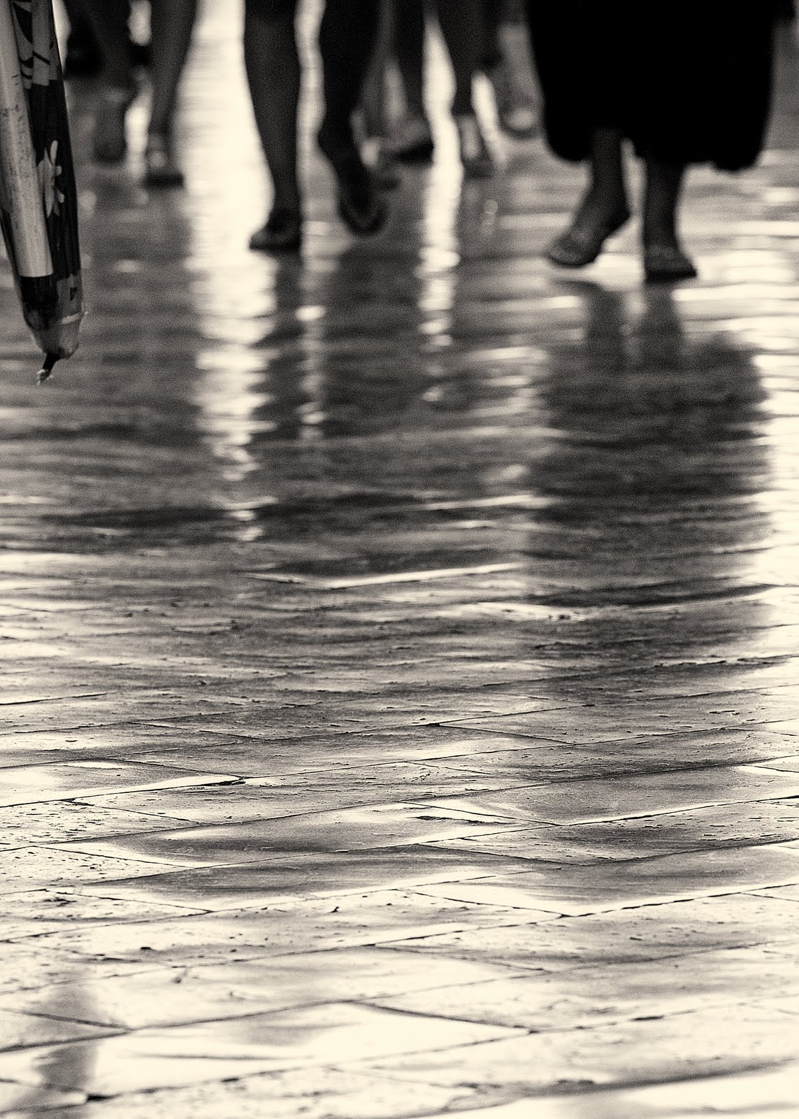
The boat isn't going anywhere. It is still. It is at rest, recumbent against a step, away from the sea and holed beneath the waterline, it is difficult to see this vessel ever pitching against the waves again. The shot is tightly cropped in the camera and this is a full frame delivery. I felt the relatively low contrast, monochrome and sepia toning speaks of a by-gone time and sympathetic to the theme of the shot. Whereas the street scene in the centre of Dubrovnik has much more energy about it. I was initially attracted to the shiny and very smooth surface of the stone road and whilst I managed to grab some shots without people (difficult in Dubrovnik in August), it was  the images with people present that worked better for me. The photograph is toned monochrome again - the full colour shot is almost monochrome - the stones having a strong blue tone running through them, but the material on the left was a a strong blue and yellow and I could either crop it out or tone it out - I took the latter choice. The shadows compliment the feet and provide the corporeal presence and this, together with the feet clearly in motion, provide the movement.

______________________________________________________________________________

                                 High                                                                                 Low


The "High" shot was taken in the very narrow streets in Dubrovnik and this image was taken looking directly up toward the sky, capturing the laundry which link the buildings - over and above the tourist another allusion to "High". The monochrome decision was taken firstly due to the singular colour of the laundry - mostly white, the lack of tone in the stonework and I think it helps the direction of travel for the viewer, that is in one direction only to the blank area i.e up and "higher".

The "Low" image contrasts in several areas, it is a shot of a puddle on the floor i.e. the opposite of  "high" and of course it is in colour and not monochrome - albeit with a restricted colour palette. Another contrast though is that the focus of the "high" shot is a blank area whereas the focal point of the low shot is the part of the image with the greatest detail - in fact the top of a very high hill outside the town boundaries. By pure coincidence the arrangement here has the two aforementioned sections orthogonal to each other thereby compounding the contrast.

______________________________________________________________________________


                                  Broad                                                                              Narrow


Despite the initial appearance the "Broad" photograph is a full colour version - it was a hazy day and I was at a relatively high altitude which limited the colour palette. The detail that is present across the foreground is suggestive of the scale of the image, the slow reveal of the ships to the left of the image will further emphasise the width of the channel in the mid distance and there is barely discernible detail on the coastal line on the right hand side further developing the impression of scale. There is tonal variation in the foreground, but it doesn't affect the scene in any way. The "Narrow" photograph on the right is an impression of apparent lack of width of the river which is derived from the viewpoint, quite high up overlooking the feed to Lake Skadar in Montenegro. The breadth of the plain as it reaches out to the lake, turning to a wetland before reaches the water emphasises the contrast to the tributary feeding the lake from the western side. In fact the channel is navigable from quite a way upstream - there are boats on the channel at the edge of the tree-line. Both of these shots were dependent on a tripod with the "Narrow" shot using a 70mm lens and the "Broad" one using a 120mm lens (the same telephoto zoom lens).

_________________________________________________________________________________

                         Liquid

The sea. The evening before I took this photograph I had been watching the sea and wondering at the constant nature of the movement on the surface of the ocean. The light had been low and creating a stronger contrast than on this shot and it seemed to me to be as close to watching infinity as there could be. I am not sure if the Dalmatian coast in this area is particularly prone to a constant agitation, maybe it's to do with the islands - but the sea wasn't still, it moved; it was fluid. A full colour shot with almost no work on the image.

                                                                                                                    Solid


The door of the church in central Dubrovnik (therefore Catholic) appeared new; I suspect it may have been replacement from when the city was under constant bombardment (another example exists later in this submission) from, mainly Montenegrins who besieged the city when they were allied with the Serb's. Dubrovnik is, in European terms, a new city, it was established in the seventh century however this door looks positively brand spanking new. I desaturated the image and then toned it this nut brown colour, so it is a monochrome image, in contrast to the sea - which is of course a trite contrast. The apparent solidity of the image contrasting with the liquidity of the water belies the opposite contrast of age - the sea being somewhat older than either the Orthodox or this Catholic church.


_________________________________________________________________________________

                             Many                                                                                               Few


The Old town of Kotor sits on the Bay of Kotor; behind it, to the south are hills and the Bay is in front and is it's commercial heritage. This shot was taken from the city walls which have historically protected it from invasion. It is difficult to discern any pattern or structure to the town - especially from this angle. The roofs seem dispersed in a completely random fashion. I cropped, in camera, to keep the image depicting the rooftops and to not include the bay and the hills in the distance. By contrast the "Few" image was taken overlooking the sea. I am not aware of what the plant is and it did strike me that it was a little precarious. The composition used depth of focus to isolate it from the background of some other vegetation and the sea; there was no horizon in the shot as I was shooting in a downward direction


__________________________________________________________________________________

                                    Curves        
                                                                                                                                       
This detail was part of the ceiling design in  Dubrovnik. Clearly the symmetrical nature of the composition is important to the image and whilst this is a duotone there wasn't a great amount of tonal variation in the cloisters where this photograph was taken. The important aspect from the image construction was to allow the eye to resolve in the central circular rose which was accomplished by having the upper arch out of focus with depth of field, and some vignetting post production to help keep the eye contained.
                                                                           Diagonal

This lady sat on these steps intent on her mobile telephone, maybe reviewing a text message or compiling one. The line of her eye looks through the telephone through to the bottom right hand corner of the image and the extension in the opposite direction is very nearly top left, thereby cutting the image in half. The steps echo this line very well albeit they run out 2/3rds within of the image; had they done so more or less I think it would unbalanced the shot. I don't think there is anything to say about the black plastic sack, the soft tones of the stone work are pleasing and the pillar to the right neatly frames the end of the photograph. I had very little to do to the image, it seemed quite ready.

__________________________________________________________________________________

I hope to make clear why I have used the same subject, but with contrasting reasons!

                           Large                                                                                           Small


This very large bridge bestrides a valley that leads to the sea (I have taken the image from a boat). It is a magnificent edifice with some beautiful geometric constructs that I found very appealing. There is a coach that is leaving the bridge on the right of the photograph which gives a real sense of scale. I was lucky with the weather, the available light allowed a fast shutter action on low image speed allowing the colours to saturate naturally and the absence of cloud didn't disrupt the sight lines of the white wires. The contrasting shot on the other hand is included because of the scale of the individual at the bottom left. That short thin dark speck - just inside the first wire bottom left - is a person looking over the edge - I suppose there is a path alongside the road, there is certainly a fence! There is detail on the sign immediately to the right of the main pillars. Both images are better composed with the main pillar set to the right, the "Large" image as it naturally balances with the construction of the bridge whereas the "Small" image as the angle of the wires are dissimilar. The very clean lines, complimented by the clean sky also help these photographs deliver the feeling of efficiency and purpose.

_________________________________________________________________________________

                          Pointed                                                                                          Blunt


The "Pointed" image is a detail from a sculpture in central Dubrovnik and  don't think there is awful lot to say about the image. The subject is clearly writing and the detail at the point of inflection where the right hand forefinger is in contact with both writing tool and the parchment is very carefully worked, suggesting that the subject was famed for his writing or at least the words that he committed to print. The rest of the statue is not as "rubbed" as this part, suggesting also that the subject was probably a spiritual leader and people have continually touched both the hand and what was written on. The arms, the hands, the writing implement all lead to the same point and at the time of photographing the image the light was shining on this part of the statue - which was probably a consideration when the statue was situated. The contrasting image is a post that connects glass panels surrounding a swimming pool. Chromium plated posts with a blunt but very shiny top; a very simple utilitarian object that fitted the blunt but not dull - in fact the opposite of dull.

_________________________________________________________________________________

    Contrast in the image

A curious phenomena that I witnessed in the the short break in Dubrovnik and Montenegro was not the amount of Russians who visited both Croatia and Montenegro, after all the Dalmatian coastline had long been a haunt of apparatchiks of the former Soviet block. It wasn't that there was a great number of apparently very affluent young people who were travelling through - maybe on one of the many super cruisers, some with their own helipads. No it was the way the young women would pose at the drop a hat (wide brimmed or not). These young ladies, and some not so young, would adopt very coy looking poses for the camera; these cameras could be held by boyfriend, husbands or female travelling companions who would, after a series of shots, return the compliment and do same for the other.
I took advantage of the pose this young lady adopted for her camera wielding accomplice. The model was standing in front of a large fountain just inside the old city wall in Dubrovnik, there are some eight or so fountain heads around the fountain and the locals drink straight from the pipes, fill their water bottles from them and generally make use of the very clean and free supply.

Dubrovnik was held under siege by the Serbian forces for about 5 months until the Croatian forces mounted a counter attack. A large part of the city buildings were damaged in part by the armaments, most of which had been manufactured by the Soviet military machine. This young lady has a fine complexion in contrast to the fountain which has, besides the wear are tear of centuries of use, several pock marks from bullets. Incidentally all across the region there are buildings, road signs and other targets riddled with bullet holes. The lady is young and the fountain isn't, she is clean and the fountain isn't, but it is likely the fountain will be when the lady isn't anymore.

_________________________________________________________________________________

I expected to take shots for personal projects on this trip - and have done so - but increasingly I felt that the project has started to inform my personal work already, something I didn't expect to happen so soon. I have always had a strong desire to connect my photography with either a sense of place or purpose, simply leaving a scene with a pleasant shot, whilst it may be a "result" would leave me feeling slightly unfulfilled and this more important when the photograph contains people. There are very few people in this assignment.
I have found this Assignment interesting from a few perspectives. As is clear I have intertwined the history of the two places into the assignment; I think the contrasting shots work without the historical perspective but adding it allows more reflection to occur. I have tried not to express any bias, I wonder if you feel there has been?


Tuesday, August 9, 2011

Contrasts - initial thoughts, work in progress

The first assignment for TAOP is contrasts and it has been on my mind for a little while. The assignment sheet suggests 8 pairs (16 photographs)  from a list of 21 pairs. In addition another photograph which demonstrates contrast in a picture - it doesn't say whether the contrast depicted should be from a pair in the list.

Contrast, from the Collins dictionary:

Contrast is a noun and verb

"The state of being noticeable different from something else when put or considered together. A difference so revealed. A thing or person noticeably different from another. The amount of difference between tones in a television picture, photograph etc. Differ noticeable, compare so as to emphasise differences.

I spent some time thinking about contrasts and without referring to the list on the course came up with:

Have/Have not   Empty/Full   Black/White*   Signed/Unsigned   Greedy/Generous  Right/Left
Bright/Dull         Rich/Poor     Framed/Unframed   Strong/Weak  Right/Wrong   Heavy/Light*
Fast/Slow    Pass/Fail    Plenty/Famine

I then compared this list with the list in the course notes  - I have put an asterisk by pairs that are coincident with my list. I am initially curious and concerned about the disparity in the two lists - I'll come on the those issues later.

I then studied the list a little and had the following thoughts. The list in the course guide looks limited in terms of the scope for interpretation, whereas my list, I know (because I've thought about it), has a scope for greater subtler meaning and connotation.

I was curious as to why there was such a disparity, was the course list meant to suggest certain images, certain interpretations and therefore a "right way" of completing the assignment; in which case I've got it completely wrong. I decided to read the assignment again. I was concerned that I wouldn't be able to produce anything that was subtle in its meaning, able to convey any sub-text or maybe I shouldn't be thinking like this. Maybe I should just deliver 8 pairs of contrast from the list and be done with it.


No subtlety here though. Black and White, Portrait and Landscape, Loud and Quiet, Alarmed and Peaceful, Awake and Asleep. Whichever, he is our grandson and we're very proud.


 I took this shot as part of a small project on graffiti when I was in Sicily recently - I was impressed by the neatness of the lettering. But for this assignment and for illustration it was the horizontal aspect which drew to me it again. Comparing this photograph with the one below which is about verticals, in the graphic sense. The image below was concerned with the aftermath of a fire which had left these scorched trunks. I took the photograph from a very low perspective and, whilst ensuring I kept the horizon in the frame, I used a wide angle lens to capture as many trees as possible

all seemingly to strive or reach for air. I appreciate that fire is part of the natural cycle of woods and forest and whilst it is destructive it is reconstructive at the same time. The bench above was bathed in a hot sun in contrast with the overcast sky in the shot on the right, the sun on the seat caused a good deal of contrast and I happened to be using film capture which has a slightly wider dynamic range than digital capture.


The image to the left is about peace and calm. The photograph was taken on a late summer's afternoon in Alberta. The ambience was very calm and quiet, no-one else seemed to be around and there is barely a ripple on the surface. Composed on the thirds with good contrast at each segment, I think this harmonious construct helps the image achieve a peaceful image.

Whereas the photograph on the right is a close up of a  cascading waterfall in the Smokey Mountains. The shot isn't easy to read immediately it takes a while for the eye to settle and recognise what it is looking at. It is a shot that is all about energy being expended, the water sprays at all angles and appears almost to come out of the frame. I took the photograph in black and white film as I felt that the energy would be best described in monochrome terms and I also felt that the addition of colour might militate against the expression of the power of the water. I focussed on the twig to try and ensure a visual structure to reference to.


The photograph on the left of a vineyard shows multiple lines of multiple plants, whereas the shot on the right is a single stem. The vineyard taken in the glow of the evening sun compares starkly with the monochrome treatment of the anthurium lily on the right. The lily was lit by a single lamp and was taken to explore the tone, texture and form - more a still life than a nature shot. All photographs are about light,- literally painting with light and the very fine grain film (Technical Pan, now discontinued) I used, set at 12.5 ISO and developed in a liquid developer produced an almost invisible grain, enabling me to reveal in great detail the subtle variations of tone in the white flower. Almost all the tonal texture was delivered by shadow and I feel the image has a sensual feel. Whereas the vineyard was annexed to a "gastronomic farm/restaurant/hotel where I was staying. The ambience of the area was rustic, with all the food that was served being grown at the farm - the image sets out to portray that artisan feel. With the vines running down toward the hills and only a few sporadic farm buildings scattered about, the feel is of a timeless bucolic image and the only similarity between the photographs is the single light source.


Two shots of similar geometric shape yet delivering two distinct feelings. The flower head on the left was taken at the Oxford botanical gardens (I didn't make a note of it's name) and the dandelion was taken close by my home in North Oxfordshire. Both images were taken on black and white film and within a couple of months of each other, two years ago. The photograph on the left doesn't allow the eye to rest easily on the petals the contrast is strong and seems to fight any concentration, whilst the dandelion has a gossamer texture inviting the viewer to rest a while and wander around it's geometric forms, all the interlocking constructs seem to contrive to keep you there; it is very calming. Whereas the flower head has the opposite effect, it rejects any intrusion and it's globular shape will repel all borders no matter where they stem(!) from. The background of both images devoid of any distraction helps both images I think.

These are then my initial thoughts and my selection of four differing contrasting images. I think I will now have a better idea of how to tackle the assignment

As I've thought more about this subject I have realised a couple of things:

Firstly that my initial list was more emotional than pictorial - the Innet list is, in the main, a set of structural ideas to build an image around, to challenge the artist to construct an image and I will use this as my basis for the assignment.

The assignment is not about any of the alternative views of contrast - zone system, local, colour, political, emotional.

Friday, August 5, 2011

Focal lengths


I thought I would explore this exercise from the stock of pictures that I have, as I have an expectation of the outcome (I will go about the exercise shortly and see what if any differences I experience). My assumption here is that it is to do with perspective. Telephoto lens's have a technical feature that crushes perspective and the longer the focal length, the more telling the effect. It takes the effect of diminishing or widening the apparent distances between objects (dependant on the lens of choice) and the viewer.


12 mm lens - River and rocks155 mm lens - River and rocks

There are some obvious general things to be seen from these comparisons, such as the close-ups tend to abstract the subject from its surroundings; the subject's points of reference (which we can see because of the comparative shots). The wider angle shots provide scale, this is probably to do with having the points of reference. 

Rocks and river. the close up is what I expected from the shoot. I had jus received the 10 stop ND filter and wanted to do some comparison shots. The tripod was used and I exchanged lenses between the wide angle and the telephoto. Whilst the ND filter will affect the pictorial content considerably, generating an ethereal quality to both it is more marked in the close up. The tactile nature of the rock, with the glistening sheen and the semi-solid looking water flow with sensual curves are very evocative. The wider angle shot minimises this effect. I'm not sure if the colour has shifted to a bluer tone on the close -up and I'm also not sure that I would to leave it in at that density if I were to present the image. There are points of reference to scale both these images and the compression effect is not as tangible on these shots.


34mm lens
Potter


 64 mm

The Potter. Again the wide angle shot places the subject in the environment - this could have been much wider and it might have been better to have included some of his end produce and raw materials (I have other shots that do do this but closer in and decided not to include for this comparison, but one is shown below for information). Nevertheless in the wider shot we can see the potter at his work, with his "slip", his coat or jacket hanging on a nail top right and his wheel the centre of his attention; in this shot the wheel appears closer to him, not quite hemmed in but without a great deal of room to move. Whereas the telephoto shot actually appears to give the subject some freedom to his right. His stance on both shots is similar but the enlarged view seems to offer more space, more room to breath. The close-up is a much more personal shot; just because it is close-up? I don't necessarily think so, it is true we can see his face, his intent and focus on the job of work; the hold that he places on the pot - the wider shot has a stationary wheel and in the close-up it is turning at full tilt. I think the intimacy of the close shot comes about with the potter at one with his work, which is difficult to discern the further back the viewpoint is - diminishing emotional perspective?? Interestingly it is more apparent in the additional shot below.


12mm lens - Bridge of sighs

                                                                85mm lens
The Bridge of Sighs: ok, it's been done a few times before. I wanted to take the wider angle shot to include the frieze on the building adjacent to the bridge. I knew this would give context and add some interest, rather than have a straightforward heads on view - as per the close-up shot, even if I zoomed out a fraction to expose either some architecture or water. The wider shot has a few context realising features, the gondolier on the canal, the banks and buildings of both sides of the canal, the inner passage of the building on our left and finally the sky (albeit a flat blue Viennese summer sky). The close-up was taken with a zoom lens and is as much about the texture and tone as about it's architectural form. The relationship with it's environment was never required in this shot, but nevertheless as far as this exercise is concerned the compression of perspective and any points of reference decouples this object from any textual considerations.


 70mm lens

These shutters appealed initially as a wide angle composition, looking down the alley, a tumble down, derelict set of storage rooms at the back of the old government house in St John's, Antigua, soon turned into another opportunity of tones and textures on the slatted fronts. Again in the close-up, there's no context as I cropped the wall out to focus on the textures and the wider shot delivers depth, tone and texture, much as the others have done.


12 mm lens - Clock tower

85mm lens - Clock tower

This is the Samrat Yantra, an astrological monument in Jantar Mantar, Jaipur, Rajasthan, India.

I had decided to take a number of shots of this, and similar, edifices in the area, focussing mainly on delivering scale. This is a tall construction, over 25 metres and all to tell the time! In the wider shot again there are a number of objects that indicate the scale of the building, the ground cover, the steps and the birds. I used the birds in the close up shot (by happenstance) and I was lucky to have one flying in the wide angle shot. The wider view gives a strong sense of size which the telephoto version cannot deliver. As one would expect the compression of perspective delivers the observation tower closer in the lower version even though the number of steps is about the same in both shots i.e. the contextual elements are consistent but the appearance of the object appears closer in the lower photograph due to reduced perspective.

I will undertake the exercise with the above in mind to collect images which either prove or disprove my understanding above


Thursday, August 4, 2011

War & Peace

Gathering my thoughts as I trawl through Clarke's  "The Photograph" I am more than slightly concerned that he is missing some history, and I hope, through the unavailability of resource. The essay of Landscape compares, quite rightly the convergence of the painter's traditional view of the landscape which informs the early photographer, such as Fenton. Fenton's view is of a bucolic diorama with as Clarke denotes "no evidence of work in a Fenton photograph." The Fenton viewfinder was ever thus; he attempted to turn the Crimea landscape into a boy's own adventure; admittedly he was constrained by exposure time, but his view of the English landscape seem to me to be entirely informed by his sense of the prevailing social strata he was born into. Fenton carried that same viewfinder to the Crimea and his many staged photographs, admittedly constricted by the length of the exposure, were all imbued with a sense of pre Baden Powell scouting jamboree.Typical of the "first "official" war photographer" - Susan Sontag, Looking at War, The New Yorker December 2, 2002 shows Colonel Hallewell, recumbent on the field with his servant pouring wine for him. No sense of battle fatigue here, no sense of the atrocity of war present under the black cloak of composition. Market forces almost certainly meant that Fenton didn't need to bother with any record of suffering, after all Prince Albert was his patron for his Crimea jaunt.

John Thomson did photograph the London streets in the Dickensian period, but didn't he see the deprivation? There are almost no references to the levels of squalor experienced by the vast majority of its inhabitants - even the socially privileged had to endure the sights and sounds of the guttersnipes.


The Temperance Sweep, John Thomson,1876/7, Bridgeman Education

Thomson has an idealised scene "The Temperance Sweep" of a "reformed chimney sweep" that has a boy looking wistfully away - as if to say "the sweep will continue on the wagon just until I'm needed at the next house to fill my lungs with soot". Thomson may have moved around the city, but his Woodburytypes never really recorded, in much the same way that Fenton never really recorded, life, at least as the masses saw life. Photography in the Victorian English tradition was for the higher social classes, there was no recognition needed to convey this misery to the masses, they couldn't afford it anyway. Dickens may have written Bleak House and his other masterpiece Hard Times, but were there no pictures?

However Thomson never struck lucky in the way that Fenton did. Fenton who never had the ability, even if ever the motivation, to capture the horror of war. Unlike Tolstoy who had witnessed at first hand the battles not that far away in Sebastopol and described them in his "Sketches from Sebastopol" and used them later as source material when he described, in epic detail, the Battles of Austerlitz and Borodino in War and Peace - probably not surpassed in the description of the utter futility and waste of war. Tolstoy, who was on the opposing side as Prince Albert's viewfinder Mr Fenton, would have recognised immediately Fenton's contested masterpiece "The valley of the shadow of death". A haunting image of a gently rolling piece of scrub land littered with cannon balls, some say this was taken twice by Fenton, once prior to the balls being placed there (no doubt by Fenton's servant).


The Valley of Death, after the charge of the Light Brigade, Roger Fenton, 1855, Bridgeman Education


Never mind, it says in that one image more than all the other photographs he took put together and multiplied by the words written by Tolstoy in War and Peace. The cannon balls roll to a mass collection in a ditch and sporadically across the dirt track in the centre of the picture like so many skulls; the track leading out of the image as fast as it can go, by the shortest route and not a speck of redemption in the blank sky. The balls redolent of the skulls in Pol Pots Killing Fields, of the Tutsi massacres and of so many conflicts since and to come.

So an image of real value from the Crimea, yet nothing of our own back yard, it will be left to Mr Gradgrind and his ilk to provide that portrait

Wednesday, August 3, 2011

Confused already

I have had the thought for some time that photography can be constructed in much the same way as painting; it can be a purely visual representation of a something, a person, a place. Both mediums can offer the same level of representation. The painter decides what to include and photographer has to decide what to leave out - an oversimplification but that's what I had generally thought. Additionally either medium can create a deeper level of image, through the use of metaphor, allegory, illusion, allusion or some other visual device, an artist can convey a thought, a message, a philosophy, a politic. Both mediums have been used to convey all sorts of messages since their inception, clearly painting for much longer, the period leading up to the enlightenment was much more straightforward (inasmuch as I know about the medium) than after, but nevertheless, if we consider the 20th century where the level of sophistication of the artists operating in either field was roughly equal, certainly by the second half of the century, then the visual language used was a common currency. At least that was what I thought.
I started to read Clarke's "The Photograph" earlier today and I got very confused about some of what he was saying. In the first essay p23 he states.."We can never enter a photograph's 'depth'. Roland Barthes rightly complained about the frustration involved in the misplaced assumption that the closer we look at a photograph, the more we see." I take this to mean that Clark is agreeing with Barthes that, as he states earlier in the paragraph, it is "flat" it is dimensionless, that we can only .."look over it and across it. We can never enter a photograph's depth". And yet over the page p24 Clark starts to deconstruct Olivia Parker's photograph "Bosc"and spends a paragraph and a half reading the image. Indeed the second paragraph starts with "But this is also an image about photographic meaning, an essay on the capacity of the photograph to both reveal and conceal its meanings..." Unless Clark is able to see all of this in an instant, to collate these hidden meanings and receive its conveyed messages in the moment that he "look(s) over it and across it" then either there is a large contradiction or, more likely I am unable to see the logic in his essay. I shall read on and hopefully all will be revealed - or maybe I will forget about this (I doubt it somehow).

In chapter 2 Clark discuss's Diane Arbus' "Identical Twins. Clark conjects that there is a tension derived from the inception of photography, the daguerrotype, that "underscore the idea of a photograph as a literal record. Each twin is a reflection of the other. But "identical" infers 'identity', and the portrayal of a self limited to the surface presence of a single entity." Clark then goes on to talk about how the viewer can then only look at the differences in the subjects apparent in the photograph, like a "spot the difference" party game. I would add that he also goes to talk about how "..establish(s), both literally and symbolically, the basis of reading the image". But I said I would leave that until it resolves itself.
The issue surely for the Arbus photograph is as Clark (I think quite rightly) states in his first essay p24 p25. that "Finally, and perhaps most significantly, a photograph fixes a moment in time." I think I had come to this conclusion in my "Truth" blog entry July previously. Clark goes on to quote Damisch saying the photograph '...it does so only in so far as it isolates, preserves and presents a moment taken from a continuum".
Well, if Arbus had called the picture sisters, or two girls in similar dress, then no tension, as Clark describes, would arise. We, according to Clark have taken direction from Arbus, in this case they are identical sisters, but we have ignored his own declaration that a photograph is a "moment in time". A different title, in Clark's conjecture, would no longer deliver a seminal work of art, but another shot that stays in the drawer as the tension derived from the title would not have us look to "ring" all the differences between the sisters.
But I don't think so; in my semi literate vocabulary I would state that we would know that in that moment of time all things can shape a face, eyes shutting or opening would effect the appearance demonstrably, one or other having a cold, or an itchy nose at the point of shutter release. The camera lies incessantly, it is Walter Mitty, it doesn't know its doing it, it can't control itself - it doesn't control itself. The artist presses the shutter.
The photograph can be read, as I think Clark means to say; but as with any work of fiction, any picture however fabricated there maybe many interpretations, but only one truth and that is the one Arbus wanted to deliver, what Parker wanted to convey.
I also know that I need to develop my vocabulary and hopefully I'll catch Clark up before he confuses me completely again.

Monday, August 1, 2011

Its an app, app, app world

I've been thinking quite a lot recently about mobile 'phone cameras and the "app's" that are available for them. I have used a mobile 'phone camera and not been too disappointed with the outcome, but I've always (underneath) thought that they have been toys, despite all the marketing b/s about megapixels, lens' by Zeiss etc etc; after all the piece of glass is hardly bigger than a pin-head and the phones themselves are about the size of a decent 12 Mega pixel sensor for a full frame dslr, so how can can you derive anything of any quality from such a paltry object?


I took this image with a Nokia mobile 'phone a couple of years ago and it still gives me the impression I had when I took it

I meet regularly with some photographers and we discuss our (photographic) work, look at prints and generally have a good time talking and being photographers for the day and at the last meeting we talked about Hipstamatic. It's existence was not known to me and I suppose if someone had mentioned it in passing I would have thought they were referring to a "beat combo" and had left the "s" off. The Hipstamatics are appearing here tonight! Well, it was explained that this was an "app" (which I do understand about) and it is designed to produce "interesting" variations of shots taken on, for example an iPhone (which I have). So the question raised was; what place did a programme that interpreted (distorted) with a range of canned recipes for creating, what is probably called "funky" or some-such versions of the original image? Where is the craft in this, isn't this just "de-skilling" photography, is it just devaluing the whole process??
I didn't think much more about Hipstamatics until I saw this shot by Sharon Kaplan on the OCA site, admittedly it was in Sharon's Hipstamatic "set", but I was struck by the colour, the pose and the composition. Many thanks to Sharon for allowing me to use this image and for more of her work please go to her flickr site at http://www.flickr.com/photos/chaoticbeaut/ you are unlikely to be disappointed.


When I looked at the thumb nail of the image I could really only see the portrait set on a strong diagonal with a window of some sort to the right. Upon enlarging, the image opened up to reveal what I suspect is a stair case leading from one side of the sitters head and another going the other way - rays!! - and positioning this young girl almost iconically inside a vignetted construction. I am quite happy to be told that this was serendipitous, that the iPhone (or whatever "smart phone") was turned to the young girl and a snap was taken in the moment and no more was thought about it or the consequence of the shutter - some jiggery pokery was then undertaken under the bonnet of the iPhone and hey presto this picture emerged. Or I could be just as happy to be told that this image was constructed thus, I've only recently become aware of Sharon's work and could quite believe it to be as intended.

I've been thinking of truth in photography for some time, truth in the respect of what and how the image is created. Whether I could ever create something that was truthful, whether I could understand where truth started and where it could predict it's demise. The difference I had always thought about analogue versus digital was that the digital shot had more levels of decoupling from the lighted image than the film camera had, what with the electronic conditioning, the software algorithms, the screen and/or printer calibrations all of which are to a greater or lesser extent out of the hands of the photographer. These are over and above what the analogue photographer had to compromise with - he just had things like chemical impurities, temperature, water acidity, emulsion variants to contend with. Arcadian days!
I've  come to the conclusion that it's a matter of trust in the artist. If the artist gives us an image we must trust the image to be what was wanted - after all the vast majority of photographs, taken as they are on impulse by holiday makers, pictures taken at parties, weddings and so forth and general happiness is the only sub-text accompanying the shot.

I was walking around Rousham House grounds yesterday trying to be creative with the initial AoP exercises and thinking about this conundrum called truth. I had film and digital cameras with me and both now capable of taking zone-plate imagery.

The pictures below are of some wrestlers, the statue, though very well worn, is about 15 inches tall, plaster based and the same now as when I first saw it about 20 years ago. It sits inside a "folly" in the grounds at Rousham House.

This is a zone plate image of the subject, D200 lens cap zone plate and given some PP in CS5


This is a mono version from a different perspective, not as intimate as it could be but shown here in whole to give a similar scale view. This was taken with a different dslr, some very slight cropping and some PP in CS5 - local contrast mainly.


And here taken on my iPhone (no hipsta action!). The colours aren't right, but it shows the scale better than the previous version above and is therefore more truthful?

At this point I think I should repeat (see earlier blog - truth) that I believe the camera is incapable of telling the truth. A Gandolfi 11 X 14 inch or even a Polaroid 20 X 24 inch have about as much claim to high fidelity reproductive verisimilitude as my iPhone. And if truth cannot be imparted from a camera, no matter the advances in technology then I repeat, the truth can only be delivered by the artist and the image is the thing.

Understanding the outcomes of process is the key to gaining control of the craft of image making; no-one should even attempt to know what goes on under the bonnet of a modern camera, there aren't any people left on the planet who understand how a modern computer works - it's just too big - so understanding how a camera works with it's hybrid collection of optics, electronic wizardry and black magic software is beyond the pale. If the photographer has a strong concept of what is likely to turn up on the LCD screen after releasing the shutter, if they know what it was they were trying to express, if what they retrieve from the camera's memory is a component part on the road to constructing the image they held in their head, or even as the raw material for a road yet to travel, then I think that is fine. It should not be an issue if the image finally presented - which in all likelihood will stay locked away either in long term storage, either on a disk or in a drawer - was taken by a smart-phone, digitally manipulated, tie-dyed and crumpled. If that is what was wanted by the artist AND when it came to life it delivered the intent the artist had that's all there is to know, surely? Or maybe Sharon had this thought that the subject was at the centre of her world at that time and that here was one way of expressing it - a mite precious perhaps but entirely possible.