Saturday, October 8, 2011

Glamour of the Gods

At the National Portrait Gallery, and other thoughts.

Formal portraiture is a difficult genre to pull off well, perhaps no more or less than any other genre, but nevertheless the formal portraitist has something to contend with that a landscape photographer doesn't have - ego and emotion, and these aren't necessarily only confined to the sitter, because to make it work the sitter has to deliver at the time of shutter release. The sitter has to provide the artist something to work with, something indeterminate that a formal portraitist, that works in non - photographic media - paint, pencils etc, can work without for large periods of the creative process, as long it becomes apparent to the artist at some stage then it can be integrated into the study, whereas the photographer has to generate an emotional charge between artist and sitter - something has to happen between them.

The "Glamour of the Gods" show at the NPG has formal portraits of, generally (I can think of one exception) actors and actresses that "want" to project, who "want" to deliver and find a relationship with the lens, the photographer and the viewer as without it they are redundant as performers. Greta Garbo had a difficult relationship with the camera and is the only exception I know of with the "stars" of "pre-war" Hollywood that this exhibition is all about. I will, however widen the scope of this entry to include other formal portrait photographers that I have some awareness of - which may limit the breadth of the entry!

I suppose my entry into this genre stems from a strong regard for film noire, watching old black and white movies as a youth, my own predilection for monochrome work and I have loosely studied this genre for a few years and started some projects of my own which I may refer to later in this entry.

The exhibition in itself was interesting and varied (inasmuch as this sub genre can be varied) and enabled me to look closely at the print quality that so far I have only seen from reproductions in books. Overall I would say that my prejudices were confirmed and it was wonderful to see these iconic portraits in the flesh, as it were.

                                                                     George Hurrell


George Hurrell's work stood out as I expected it would and showed an artist and craftsman at the peak of his ability and his iconic images of Shearer, Crawford, Bergman, Harlow were every bit as beautiful as I had come to know. Whilst this isn't a comment of how Hurrell came to be one of the leading studio stills photographers it is likely that I will return to his work to illustrate his technique and how others adopted similar working practices in the furtherance of this medium.

When I first started to look into this genre I didn't notice how expertly these portraits of the stars had been worked, how they had been retouched, maybe that's a naive position to start with, after all it's called "photoshopping" now. But when I researched it a little some years ago I found to my surprise how much retouching had gone on. And, as always, once you know its there it's difficult not to notice it anymore. In the first couple of decades of the last century the technical quality of retouching was relatively weak and the photographer relied on heavy diffusion to disguise he imperfections of their protege stars and starlets.

An exemplar of this retouching technique is shown below.


The twin shots above have become common currency in the discourse regarding touching, however it is still interesting to see how far the studios were prepared to go to create the illusion of what they considered perfection, for that is what Gods are. Joan Crawford's face becomes devoid of wrinkles, lines AND freckles. Hurrell would ask that his sitters wear little or no makeup when coming to him as this would enable him to work things more efficiently.

These techniques were applied to both sexes and as the technical capabilities and craft improved both genders received higher levels of sophisticated retouching and whereas the male stars generally fared better it did become completely over the top in some less than capable hands by the ends of the 1930's and early 1940's. The universal process or retouching largely died out after the second war as the studios went for a more "realistic" look but is now is as pervasive as ever with Photoshop and the star machine working as hard as ever.

I'm undecided about the moral and ethical issues at work here. Clearly there are victims here, but it isn't necessarily easy to work out who. The stars? The viewing public? Impressionable youth? The impressionable?

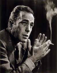
Humphrey Bogart

Hurrell's technique developed over several decades and used quite dramatic lighting and was said to have said "it doesn't matter where the light falls, it's where the shadows land". But the whole process of star making changed after the war and with it went the 8X10 cameras for a more convenient camera capable of more shots more conveniently, allowing for more mistakes with faster emulsions, that delivered finer and more controllable grain and wider tonal range. In came colour and whilst Hurrell adopted it, the effects that he had created, along with the others of the pre-war era were never quite re-created (in my view).

Norma Shearer                                                                                  Jean Harlow


Norma Shearer gave Hurrell his first big break and there are a lot of Hurrell/Shearer shots and he loved photographing Harlow also, almost as much as she liked having her photograph taken.

I've placed an alternate portrait of Bogart with one by Yousuf Karsh. I think there is a great similarity in the projection from the print,. The portrait of Pablo Casals is a far more enigmatic pose. Hurrell wasn't about delivering the soul of the sitter, more mystique, Karsh, who by the time he got to photograph Casals was able to pick and choose his subjects and, to some extent, dictate the delivery style.

‘I decided to photograph the master of the ’cello from the back, in a partially restored abbey in Prades … lost in his music. For me, the bare room conveys the loneliness of the artist, at the pinnacle of his art, and also the loneliness of exile.’ (Karsh)


Prades is in South West France and Casals appeared there as a regular during his exile from Franco's Spain. If the viewer is in the North then the light would be coming from South West - Spain, an interesting thought. I've seen a print of the Casals and others by Karsh in the hotel in Ottawa where he had a studio for many years. That are very impressive in size and ambition.


Some views and my own interpretations:


Rebecca, left simply shot on a diagonal flow, with a single tungsten lamp above and left, creating a strong shadow, the image on the right is my take of the Louise Brooks portrait by Eugene Robert Richee, itself inspired by Aubrey Beardsley's pen and ink work (something very familiar to me from student days). Again a single tungsten lamp this time high and right. I have to say that my piece is far too fussy.

The images of Lisa were drawn from the stills of Hurrell and my attempts to add a dramatic element, as if from a film set - these Hollywood stills photographers had just a few minutes between takes to create their publicity shots and sometimes seconds!

Unlike the shots of Rebecca these were digital captures as I wanted to start to develop my re-touching skills (I also took a large number at the same session with film). Single tungsten lamp. The shot left has a Hurrell Crawford shot in the back of my mind and the opposite image has a Shearer shot where Hurrell brought her legs into view to prove that her concern over "my legs are one of my worst features" could be shot to her advantage.

Madeleine was a ballerina with the Royal and has a very significant photographic background, her father, a professional photographer, pioneered Kodak into the UK. Together with her husband, also a professional photographer combined to have her posing from the age of 3 (she didn't tell me this until the first posing session! No pressure there then!).
However, whilst the shot left, taken with a 6X6 on Ilford Delta 100 - no orthographic film for me, that laid the basis for Hurrell's early work and reputation. The second shot is from a series where I attempted to recreate some of the glamour practices from todays photographers, so digital and a lot of re-touching. I worked very hard to eliminate any wrinkles, lines, imperfections that would be anathema to today's photo stars. The link of course is that Madeline has a direct connection both with the era from which I draw inspiration - I have seen her portrait with Danny Kaye and others from stage and screen with photography being the another connection

Friday, October 7, 2011

It's all about the money

Post Modernism at the V&A


The highlight (for me) of the exhibition was the photography hall, it displayed a relatively few, but widely varied images from the period 1970 to 1990. The introduction mentioned three categories of parody/appropriation; Nature and artifice and lastly Tableau (though it was described differently – I hope I haven’t misinterpreted).

Haywain by Peter Kennard.

A depiction the Haywain by Constable with a cruise missile launch system transplanted onto the Haywain itself. The background image is a copy-print and has a monochrome/black and white delivery (there is a colour version). The image itself  i.e. without the interjection of the cruise missile – which was as much about the MoD’s beautification of the missile – could have played a Po-Mo part inasmuch as it is a clear devaluation of the original, cloned for the popular consumption in a consumer age. Constable for the people, re-packaged for a monotonic bijoux dining room?? The addition of the cruise missile added a dark humour and a political sub-text missing in most other pieces on show, both in the photographic hall and the main exhibition hall.

Carrots by Shrigley


A strategically placed carrot seed packet, clearly set at the end of a drill in and amongst some cacti in an otherwise arid desert or plain. These root vegetables need water, cacti don’t, the sun was burning down, the carrots won’t survive – the art is therefore ephemeral; a disposable item in this new consumer age. See later.


Canned Sunset by Keith Arnatt. Ostensibly the author takes discarded items from waste tips and rubbish and finds beauty in the abstracted artifice. This picture was a discarded tin can, lit and placed in what appears to be water, but could just as easily be effluent. There was another large print of waste in water that I didn’t take note of that used highly saturated colours to almost romanticise the discard of our lives.


Sarah Jones – The dining room


This picture I thought was meant to be funny, wry, ironic and worked at those levels for me. Three young females – mid to late teens – situated in a very formal, dining room. The formality of the décor, proportioned prints on the wall, a mantelpiece decorated with the trophies of staid middle class life. The dining table highly polished and pictured centrally on the table and lit quite brightly was a willow pattern china tureen that seemed to occupy the focus of their collective emotion. Two of the girls looking at it, with what could be described as disdain, whilst the third girl has her head on the table face – down, in a pose of exasperation. This was a carefully staged production. These three girls effectively saying this paraphinalia has nothing to do with me/us. Why are we here? "Beam me up". And yet this solidity of surrounding held them there. This “old – world” with different values, different histories had no relevance to the world this new generation were a part of – their clothes were of a different generation, colourful - not Post-Modernist, they hadn’t interjected any irony into their view of life and how they present themselves – they just wanted out, back to their future - were they, in fact, being "protected" from what they wanted? The image comes from a series of similar scenes using the same girls, but in different positions.

Jeff Wall’s “outburst” tableau – not on the surface a very worthy piece – need to consider further

Claire Stoppard – Scene’s of a struggle.

Like so many visits to exhibitions I started it the wrong end, not on purpose, it’s just where I seem to find myself, like a habit, and again I found after I had viewed the series I turned up at the start to then read the introduction. A dozen or so images that were carefully printed to look like working documents, not pieces of art (at least not treasured art), where placed in a line along three sides of the hall (at one end of the short hall). These black and white images where clearly meant to depict scenes of a crime - whether it was the same crime we didn't know, that was for the viewer to determine. I understand, but have never seen any to comment with any authority, that there are a lot of “forensic police” serialisations on television - CSI -  and these shots may have been influenced by them. Dispassionate shots of high contrast “scenes” with circles and arrows (reminds me of Alice’s Restaurant by Arlo Guthrie) depicting evidential data for us, the viewer to consume. And I think this was the point. We were participating in one of the by-products of this new consumer age. Here were items specified, depicted, highlighted for our attention, itself an ever decreasing commodity these days, so that we didn’t have to dwell on the image too long, we, the viewer, were presented with arrows directing us to the solution. Like a modern day police saga where the science convicts the criminal with just a few particles of evidence. The viewer is served up with the incriminating evidence and can move on to consume something else, maybe with a bit more juice next time? This then wasn't irony, not humour, this was an indictment on society and a relevant one, possibly more relevant that anything in the main exhibition.

Cindy Sherman – transformation

I was glad to have seen a couple of Sherman’s pieces - this one is in the main exhibition, but there has been so much discussed and written about her work that I found very little to add. About transformation, about the shallowness of image within culture today and most certainly Post Modernist with wit and an extremely accomplished delivery.


Karen Knorr’s “work of art” – constructed as a piece of classical/proper art. The image on the left is a hair grip and the left is a pair of tweezers.

The card on the left reads: Hair Clip. Used to secure hot curlers in the hair. Rollers were electrically heated the applied to the hair, which was scorched into temporary curls. British c. 1980's

The card on the right reads; Tweezers.  thought to have been used for the removal of hair ... (I didn't note any more down - but you get the gist). This might have started as an exercise in typography, it is certainly a deadpan delivery, maybe there are more in the series - I liked the prints, I'm not sure about the wry commentary.


James Welling Platinum/Palladium. I was probably always going to enjoy this. The classical processing of a installation designed to show off a piece of objet d'art, minus the piece of objet d'art! The work involved to create a Platinum Palladium print – especially if one considers that route the artist has to take to gain the skills to be able to create a print like this AND THEN not use it to present an object, but to exhibit its absence, it’s presentation mount of velvet, which interestingly is a perfect material to deliver the Platinum/Palladium’s graphic capability. Nice one Mr. Welling.

Richard Prince – Cowboys. Another iconic photograph of the genre – and already having an ocean or words recorded in its wake.


There are a lot more photographs in this hall and some more in the main exhibition.


The rest of the exhibition.

I found it absorbing on one level and disappointing on another level and finally revelatory I was disappointed in that whilst I found a few pieces that I thought beautiful, the sketches for the “Best” store, the 3D work in wood and some, but not all, of the Kitsch tableware I didn’t come away feeling inspired about anything. I did come away feeling that I “got-it”; but I’ll come to that later.

There were a significant number of references to classical art, columnades, scrolls found in two and three dimensional work. There were also a number of Art Nouveau references, especially around the furniture pieces and homeware; for example the chest by de Bruyne(?) – Art Nouveau meets neo-classicism?!?

Fill the space! I also thought that the artists were determined to give full value for their art commissions.  Gehry’s house for example left very little space, it was his own commission I believe. It appeared as if he felt the need to deliver no space, negative or otherwise – he used it all up, filling the voids with construction as if it were all an opportunity to demonstrate his ideas.

Ad-hoc assemblies. There are a  number of “ad-hoc” assemblies, for example a “sound system” with speakers, a record deck and I assume some kind of “deck” with a guitar built in. This was clearly an assemblage with no utilitarian value, it’s point was to reflect the consumer need against the jetsam of everyday life. Whereas the chairs/stool were “crafted”. They could be used as stools  - no-one was allowed to do a weight check, but they looked more than some insubstantial creation - one piece didn’t look very comfortable but nevertheless they appeared functional. The trembly table didn’t look scared!  But it did have shapely legs – see picture below. Note the use of ironic colour (I'm being ironic here).

The sketches for the “Best” outlet were beautifully crafted – needing to depict the “installation” correctly for their client, this despite their patron being a generous benefactor for the arts.

And as we near the end of the tour we get to “Money” – to Martin Amis’ quotation about money having no morals but before I move to that I wanted to mention Takamatsu – whose beautiful images of utilitarian “machine-like” buildings, seemed less about Post Modernism and more to do with architecture mirroring the society and civilisation it was to end up in – I am sure I am missing a very big and blunt point with his work, but for me there was no irony in the art, there may be fun with the ornamentation. I did however admire the draftsmanship and wonder whether they existed before "Blade Runner" or did it (the film) influence Takamatsu?

Then……..”protect me from what I want”. Whether this was the point the curator wanted to project I'm not sure, but my overall takeaway from the main exhibition was about consumerism, about the way in which these artists had either followed the money or had tried to lead the way towards it. I didn’t feel the quelling of the old order – sure there were a lot of “ironic” references to prior movements, but irony is a weak tool when used continually and I didn’t really see any other device in the main exhibition to warrant a strong PM theme. There was a strong use of colour throughout, quirky ideas not had little functional value, but I saw no “brave new trajectory” more an assimilation into a Thatcherite grab for cash. Follow the money. 


Wharhol

Post Modernism may have started in the 1950’s, it may have had a natural reaction to some of the societal utilitarian injusticies built in the name of “social solution” from Le Corbusier and others, and so it should have. But this collection of pieces had no political comment that I could discern, no fight against right or left, no search for a new way other than lucre.
Who was the spirit in the machine whining for protection against what they wanted? Or was that one last splash of irony tempered by the one piece of truth I found, Amis’s view that money has no sense of right or wrong, it doesn’t care what we call it, it doesn’t have any morals and I found few to see at the exhibition.


Thursday, October 6, 2011

Some new ideas

I have started to look at a small corner of the village, it is about 200 yards from where I live, so no great difficulty trekking to the site! The place is at cross roads in time and the local farmer, to make ends meet, has allowed two mobile phone operators (I thought there were three) to mount their base stations there. It also happens to be on a old footpath to the next village and the new installations are annexed to a large barn that holds hay and feed for the Charolais cattle that are reared for their beef.
So the interest is focussed around the idea of communication, from the pathways that were set down in the middle ages or even beyond to the adjoining village, in this case Duns Tew. Whilst I am not totally sure about how this exercise is going to pan out I have starting to try and combine the exercise requirements, which are about elemental compositional structure and juxtaposing this with images in and around the site. We'll see what develops!


The "lead-in" shot(s). The sign post to Duns Tew and the path way to the next fence and the barn and mobile phone base stations - the beacon rising from the back of the barn. The sign post shot, whilst it has some geometric value, doesn't do enough to bring the viewer in, it needs space whereas the pathway shot has the track that leads to the site of specific interest.


I have decided that if I decide to tone then there will be a single tone across the assignment and if I make that decision then it is likely to the tone of these four immediately below.


An alternate view, with what might become the preferred treatment. The square crop is tighter and more dynamic, the upper shot seems looser - less directive. The verticals and horizontals, triangle seem stronger also on the alternate view. The shot on the right is not dissimilar that the first version but toned to provide consistency


The barbed wire stays - left - is a very geometric utilitarian structure with a number of design elements integrated in its form. The tall spindle have a triangular shape implied in their collective ends. There is a strong rhythm to the spindles and the tie ends as well as triangles associated with the main mounting pillar. The telegraph pole could well be described as a single point which dominates the image, it has an echo with the next pole, linked with telegraph wire into a  number of triangular shapes.


 The bales (in the barn) are of course horizontals/ verticals. The rotated double barbed wire exhibits curve and points and whilst it has geometrc value brings little contextual currency to this project, which is a shame as I deliberately captured this with as little background as possible to isolate it. So, there's a lesson, keep in mind the context for the shot.


The beacon below is a strong diagonal in the ay I composed it - it could just as easily be a vertical, but it would have been less dynamic and the whiff of a cloud that trails the peak of the tower adds a little drama. I think the sensual curvature of the barbed wire is a natural juxtaposition of the role it provides


I'm wondering about the shot with the curving barbed wire. Whilst I don't belong to a camera club, I have a feeling that a predictable response would be to "keep the horizon on the level" and the foreground horizon of the fence dominates and throws the image into some confusion. I'll need to think about this.


 The signpost, pushed to one side by some force or other provides a number of strong design constructs. However within a series it could tie in with the reverse of the signpost - in that it mis-directs, it mis-informs. The fencing, opposite, surrounds the "Orange" mobile 'phone base station. There are lots of verticals, lots of horizontals, a triangle and a clear composition that deflects the gaze to the right hand side of the image, away from the "Orange" mobile 'phone base station that provide essential and non-essential comunication within and without the village.


I have included in this draft a number of close-up shots to isolate some of the feelings that I gathered from the site. There are some clear elemental shapes that have come out; the diagonal beacon, the curve of the barbed wire, the combination of curve and diagonal on the close up of the barbed wire.


The shots, above and below, are of one of the fenced-in base stations (T-Mobile, I think) and I have mixed feelings about both. The mono treatment reduces the impact of the warning triangle (which I tried to include in individual apertures in the fence), however the fencing is bolder in the mono version. If anyone reads this I would appreciate their view!


These shots (above and below), from an EoD perspective are about rhythm, pattern and geometric shape but they are also about containment. The fencing to keep people away from the base station that itself enables people to get together and the couplings which tether the barbed wire around the compound. I think the shot with the single barb would be the one to keep.


Communications and communicating:

All roads lead to Rome.

I have added some photographs that have geometric shapes incorporated in roads and tracks in and around the village. I was looking for lines of construction, lines that connected this village, its people, its community with the world. So, lines of construction that were in fact lines of communication - the sweep of the road as it leaves Westcote Barton, the junction to Sandford as the two roads join exiting to the left of the image and flowing down and out. The track to Purgatory is a delightful walk in the sun and has a lot of potential for photographic study; here is a triptych made some time ago:

This maybe too small, but it gives an impression of isolation, maybe desolation for the people who lived there many years ago. However I digress. The Purgatory track photograph has a neat triangular element, together with strong "lead-in" lines that draw the viewer into the shot, whilst the heavy foliage keeps the attention moving towards the point of resolution.
The exception that I notice about these four photographs, and, when I look at others that I haven't brought to this entry, is about exit. The shots that I have taken are predominantly about leaving the village - the village is very often behind the view of the camera. The exception being the public footpath, which is a circular shot i.e. the line of travel follows the fence and revolves around the tree-line and starts to had back to the point at which it starts from, almost resolving at the point it starts from - going nowhere. I had been considering how the demographics of the village will alter as more and more of the younger generation move out to be replaced with older, wealthier people. Maybe I had exodus sub-conscienslouly reverberating in my mind as I turned the camera away from the village to watch them leave?


The road leaving (in this composition) the village to Enstone.


At the turn-off to Sandford St Martin and away to Enstone.


 A public foot-path from Westcote Barton towards Middle Barton, following the field edge and curving round from the right to the left


The track to Purgatory, right - a small settlement -now uninhabited from Steeple Barton. It gained the name of Purgatory as it was about 2 miles from the settlement to the nearest habitation and this track gets very muddy with only a small amount of rain.


The reverse of a signpost at the Sandford St Martin end of Westcote Barton. Signposts are designed to provide basic communication, the reverse shot provides no information and prevents the flow of information. Perhaps this is a reaction to the effect of people leaving the village - the road to nowhere?


The barbed wire, with a gentle sinusoidal wave seeks to protect the mobile 'phone base station, itself a communication device for the people that it is providing protection from.


Again, more fence shots. Post impressions, looking at the selection, is that I have a strong feeling of exclusion; of the architecture in this tiny area being designed to keep people away, which I suppose is as it should be. Maybe the design is supposed to be precautionary, perhaps that what was in the design brief? Rhythm and pattern on the left and horizontals on the right.


Well my first impressions aren't that good! The mix doesn't seem right and the indiscriminate processing doesn't help to pull this together as a cohesive set. I have appeared to have included too many barbed wire shots, but the bard wire is a modern invention (at least in the context of the twin periods I am attempting to link) and I see it as important. The vertical barb wire is almost a written sign, a hieroglyph, that is telling people to beware - stay away, do not come near. Right next to this site, literally adjoining this barbed area off is a gate, it can be seen in the long shot of the barn (intro shot), which has an array of signs  which are quite threatening to people who might want to exercise their right of way towards Duns Tew.


I'm fairly sure that Brian (for that is the farmer's name) would shoot a dog that troubled his very valuable Charolais cattle - except that his herd never use this field. However this pathway is on a very old route that is open to all and sundry - not sure it looks that way and when Brian gets belligerent he lets his bull loose in the field. What I really quite enjoyed about Brian's signs is that he appears to have developed his own font, clearly the "after" is very important and when I saw this I thought that he had got carried away with his emotion and forgot the "f" and had to squeeze it in afterwards, but no, there is another similar sign leading into this field that has a similar construct. I'll ask him about it the next time we get some eggs from him (I'll also ask how many dogs he's shot!).

I need to look closer for a wider range of design elements - which may come from the images that I've taken over the last couple of days - including single and multiple points and a few others.


Post addition thoughts are that my thoughts are starting to come together - I am thinking that the assignment should be about communication and it's converse. How the symbols we take for granted, roads, tracks, fences, signs etc are part of a web of communication devices and how we can reverse the interconnectedness of everything very easily either by damage or by mis-reading.

Wednesday, October 5, 2011

Back to the future

Resisting all temptation to try and provide literal superlatives for the EoD assignment I shall try and assemble a series of images that exhibit the requirements of the assignment but start to draw together some of my thoughts regarding a narrative. I have been considering how I should contextualise my photography going forward and whilst I have an eye on the later demands of the course I am mindful not to jump too far ahead at this stage. However I want to try and lay some foundations for the work that will come.

My thoughts at this moment are to do with transition, historical and contemporary, and not necessarily in that order. I have had the idea to fix this in the village where I live and have lived for over a quarter of a century, and as things stand it will be where I live when I meet my end (some time away I hope at the moment).
Coming to this village we, as a family, were keen to settle in, we had two very young boys aged three and four and I worked away a lot (abroad). My wife, with the boys, had an access card to the community with playgroup, then pre-school, to meet others and we found there were a few families with a similar background to us who were keen to engage, to find a sense of belonging. These acquaintances soon become friends and then, in the absence of a stronger verb to describe them - very good friends. The transition of a set of people, settling by pure coincidence in a foreign place and making a new life.
There were also the roots of the village, the families who had been here for generations and it took a lot longer for them to accept us - and some have yet still to do so! So another transition is there, a changing population, the previous solidity of a community being invaded - most of the "new people" had moved into a small new estate, whilst the older inhabitants were still in the cottages or the "social housing".
Relatively close by is the airbase at Upper Heyford. This base was a RAF base until the payback to the Americans for their "help" in the second war whereupon they took it over and for a while it was an operational base for F111's - they flew to Libya from there to have a go at Gaddafi. During that time there were a lot of officers in the village - officers were allowed to live off-base and they contributed to our life and village life; they have all now left as the base closed - more transition.
I'm concerned to research the transitionary forces that affected the village in a generation or two before we came here - how the war affected life here, there were soldiers billeted in the village, the economic conditions of the depression, the first world war - maybe even as far back as the acts of (in)exclusion as the shape of the countryside is dominated by estate owners who have farm managers - who are by their nature transitory. I can start with the village's history group.

As for the present I am interested to view the ebb and flow of life on the village today - there is a view that life is speeding up, we need transportation in the village, we need access to technology (our broadband speed is slow by global standards), we need mobile communication - we have three mobile 'phone masts in the village - all in the same farmer's land (well it is the highest elevation in the village). There is a fear that further development will be made inside the and on the periphery of the village - so the fear of transition.

Whilst I'm aware that I may have got an idea, it is still too big and needs to be researched, pared down into bite size chunks and developed for the various assignments I have to do.

Post posting note(s):

Communication - juxtapose the modern and the historic - e.g. mobile telephone masts, roads with inter-village tracks to Duns Tew, Purgatory, Steeple Barton, Kiddington.

Ideas: Barbed wire around the base station - rhythm; barbed wire, diagonal, triangle,,
          Fencing - rhythm, horizontal & verticals, diagonals, triangles,,
          Mast - verticals, triangles,,
          Barn - triangles, diagonals, single points,,
          Track leading away - curves, horizontals

Tuesday, October 4, 2011

Finding the right lens

I have been thinking about things a lot recently. Things happen. We had a birth in the family and I am now a grandfather. We had the loss of a very dear and close friend, which has hit me harder than I thought it would - telegraphed though as it was. And I also feel I may be at a transition point (again) with respect to what I want to do with photography and how it can give my thoughts some expression and presence.
It isn't melancholia that has brought about this point of inflection, rather the continued concentrated focus on photography and art that, combined with these personal events, have maybe precipitated the process a little earlier than it might have occurred otherwise. This minor crisis of confidence centres around whether I should consider the exercises/assignments as purely technical requirements that I should prove mastery of or, whether I should start/continue with the artistic journey that I have been on, albeit falteringly, for the best part of my life? I am inclined to throw caution to the wind and try and let go. I feel that the exercises are designed to try and instil some common currency into the students, some common terms of reference, some common language that can be used in the middle and later stages of the course, and if so I think that it might affect my language and possibly inhibit my expression.

This image of the pavement in Dubrovnik was taken to provide stock for the first assignment, but also knowing that it could be used as part of the Elements of Design - which theoretically I am working on now. In fact, I had taken enough images in Dubrovnik to cover off both assignments and did the same in Montenegro a few days later. However, whist I can find the images to suit the "bill" I am resisting the temptation to "cover-off" the assignment, rattle off the exercises with some array of tedious images because they won't have any resonance with what I want to feel about photography. I started to get frustrated during the trip to Dubrovnik and Montenegro in that I found an underlying echo of the the relatively recent wars, the latent animosity that lies barely submerged in the psyche of the peoples and the buildings - pocked as they are with bullet damage. But I wasn't brave enough to let that determine my eyesight. I did start (here I am trying to ameliorate my conscience) to record some of the collateral damage in the architecture, but it was too little too late. I did start to comment on the role of state and church in the preface to the first assignment, but I had no comment back from my tutor on the relevance of my observations and I clearly let it slip - pragmatism winning out on the day I suppose; as to do more with that subject would probably incur a great deal of time in the Balkans.


I am inclined to consider my "subject" to be the village that I live in - I have had some conversations in the Forums around this and I have considered only one other subject. My other "subject" would/could possibly be my father. Both subjects will have memory associations, my father died of a brain tumour when he was 69. The village's memory will have to be researched and then associated with the present, much in the same way as using my predecessor in that my relationship with him was not one that I would wish inflicted on any father/son combination. I see too much of Turgenev's Bazarov from "Father and Son" in me and I do not see in this course some effort of reconciliation - however that weight will bare down on whatever I try and create.
The photo of the dandelion - taken within the village - initially with a view to EoD's "round" suggests something that the village has become to mean to me today. I have been in the village for 26 years or so, our sons, whilst born elsewhere, came here as babes and know this place as their home, their anchor. Our life here is supportive and supported, connected and whilst not homogenous, its leaks are acceptable . The dandelions "show" of interconnectedness, of mutual support and reliance, of a determination to hold together in a multi-stranded way against the elements. I appreciate that the analogy may break down when the wind blows the seed heads to their fortune, but the dandelion has evolved to try and make that determination under it's own terms and our son's have left the village now under their own terms, their seed having been sown now producing more sons - and maybe daughters as well. Who knows.
This isn't some bucolic vision of middle England, Middle Barton isn't the warm toned idyll of Downton Abbey, but maybe, just maybe it could be the germinating seed of inspiration that I need to help me shake off this anchor around my neck.